Spec
Document your design system in Panda.
A spec is a readable JSON representation of the theme structure in your panda config. They're designed to be used for documentation purposes in your own docs websites and Storybook. Some common use cases:
- Document tokens in your theme (colors, spacing, fonts, etc.)
- Showcase the recipes and slot recipes (include their variants and default variants)
- Document the typography styles and layer styles
Spec Command
To create the spec files, run the following command in your terminal:
pnpm panda specLearn more about the spec CLI flags here
Spec Output
The spec command generates a set of JSON files that represent your entire design system. Here's an example of the output structure:
styled-system/
└── specs/                        # Generated documentation-ready spec files
    ├── animation-styles.json     # Animation style presets (empty if none defined)
    ├── color-palette.json        # List of palette names (blue, teal, etc.)
    ├── conditions.json           # Condition selectors (_hover, _focus, ...)
    ├── keyframes.json            # Keyframe definitions (spin, ping, ...)
    ├── layer-styles.json         # Layer style definitions (card, overlay, ...)
    ├── patterns.json             # Pattern definitions + their properties
    ├── recipes.json              # Component recipes + variants + defaults
    ├── semantic-tokens.json      # Semantic tokens with conditions (base, dark, etc.)
    ├── text-styles.json          # Text style definitions (xs, sm, md, ...)
    └── tokens.json               # Raw design tokens grouped by category
Below is a breakdown of what each file contains and how it can be used.
tokens.json
Structure
This file contains an array of raw design tokens grouped by category
{
  "type": "tokens",
  "data": [
    {
      "type": "colors",
      "values": [
        {
          "name": "purple.800",
          "value": "#6b21a8",
          "cssVar": "var(--colors-purple-800)"
        }
      ],
      "tokenFunctionExamples": ["token('colors.purple.800')", "token.var('colors.purple.800')"],
      "functionExamples": ["css({ color: 'purple.800' })"],
      "jsxExamples": ["<Box color='purple.800' />"]
    }
  ]
}
Each token in the values array includes:
- name: token key (e.g., 2xs, md, primary)
- value: resolved CSS value (e.g., "1rem", "#F6E458")
- cssVar: the generated CSS custom property
- tokenFunctionExamples: examples of how to use the token in the
tokenfunction - functionExamples: examples of how to use the token in the
cssfunction - jsxExamples: examples of how to use the token in JSX
Usage
Here's an example of how to document color tokens:
import { grid } from 'styled-system/patterns'
import tokens from 'styled-system/specs/tokens.json'
const Demo = () => {
const colors = tokens.data.find(token => token.type === 'colors')
return (
<div className={grid({ padding: '40px', columns: 3, gap: '4' })}>
{colors?.values.map(color => (
<div key={color.name}>
<p>{color.name}</p>
<p>{color.value}</p>
<div
style={{
width: '100px',
height: '100px',
background: color.value,
border: '1px solid lightgray'
}}
/>
</div>
))}
</div>
)
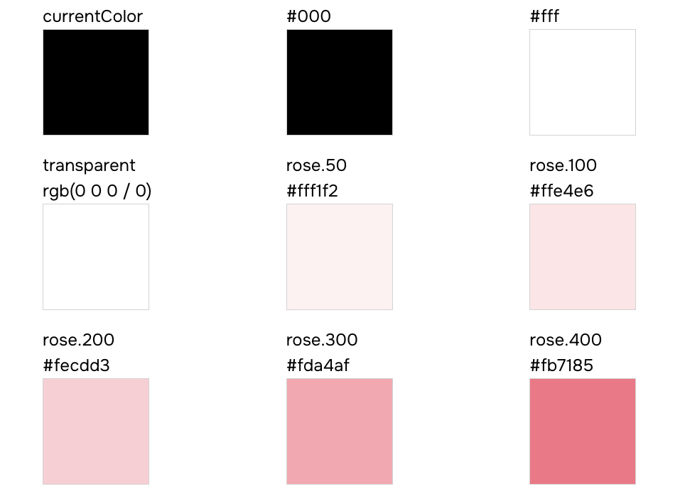
}Your color token documentation should look similar to this:
semantic-tokens.json
Structure
This file contains an array of semantic token definitions grouped by category, with conditional values for different modes (e.g., light/dark).
{
  "type": "semantic-tokens",
  "data": [
    {
      "type": "colors",
      "values": [
        {
          "name": "bg",
          "values": [
            { "value": "{colors.white}", "condition": "base" },
            { "value": "{colors.dark}", "condition": "dark" }
          ],
          "cssVar": "var(--colors-bg)"
        }
      ],
      "tokenFunctionExamples": ["token('colors.bg')", "token.var('colors.bg')"],
      "functionExamples": ["css({ color: 'bg' })"],
      "jsxExamples": ["<Box color='bg' />"]
    }
  ]
}
Each semantic token in the values array includes:
- name: the semantic token key (e.g.,
bg,fg.muted,accent) - values: an array of conditional mappings, each with:
- value: the resolved token reference (e.g.,
{colors.white}) - condition: the condition name (e.g.,
base,dark)
- value: the resolved token reference (e.g.,
- cssVar: the generated CSS custom property
- tokenFunctionExamples: examples of how to use the token in the
tokenfunction - functionExamples: examples of how to use the token in the
cssfunction - jsxExamples: examples of how to use the token in JSX
Usage
Here's an example of how to document semantic color tokens with their conditional values:
import semanticTokens from 'styled-system/specs/semantic-tokens.json'

const Demo = () => {
  const colors = semanticTokens.data.find(token => token.type === 'colors')
  return (
    <div>
      {colors?.values.map(token => (
        <div key={token.name}>
          <p>{token.name}</p>
          <p>{token.cssVar}</p>
          <div>
            {token.values.map(({ condition, value }) => (
              <div key={condition}>
                <span>{condition}</span>
                <p>{value}</p>
              </div>
            ))}
          </div>
        </div>
      ))}
    </div>
  )
}
recipes.json
Structure
This file contains an array of recipe definitions for styling components with variant support.
{
  "type": "recipes",
  "data": [
    {
      "name": "button",
      "description": "A button style",
      "variants": {
        "shape": ["square", "circle"],
        "color": ["main", "black", "white"],
        "size": ["sm", "md", "lg"]
      },
      "defaultVariants": {
        "shape": "square",
        "color": "main",
        "size": "md"
      },
      "functionExamples": ["button({ shape: 'square' })", "button({ color: 'main' })", "button({ size: 'sm' })"],
      "jsxExamples": ["<Button shape='square' />", "<Button color='main' />", "<Button size='sm' />"]
    }
  ]
}
Each recipe in the data array includes:
- name: the recipe name (e.g.,
button,card) - description: optional description of what the recipe does
- variants: an object where each key is a variant name and each value is an array of allowed options
- defaultVariants: an object defining the default option for each variant
- functionExamples: examples of how to use the recipe function
- jsxExamples: examples of how to use the recipe in JSX
Usage
Here's an example of how to document a button recipe within a table:
import recipes from 'styled-system/specs/recipes.json'
const Demo = () => {
const buttonRecipe = recipes.data.find(recipe => recipe.name === 'button')
const defaultVariants = buttonRecipe?.defaultVariants || {}
return (
<div>
<h2>{buttonRecipe?.name}</h2>
{buttonRecipe?.description && <p>{buttonRecipe.description}</p>}
<table>
<thead>
<tr>
<th>Variant</th>
<th>Options</th>
<th>Default</th>
</tr>
</thead>
<tbody>
{Object.entries(buttonRecipe?.variants || {}).map(([key, options]) => (
<tr key={key}>
<td>{key}</td>
<td>
{(options as string[]).map(option => (
<span key={option}>{option}</span>
))}
</td>
<td>{defaultVariants[key as keyof typeof defaultVariants] || 'none'}</td>
</tr>
))}
</tbody>
</table>
</div>
)
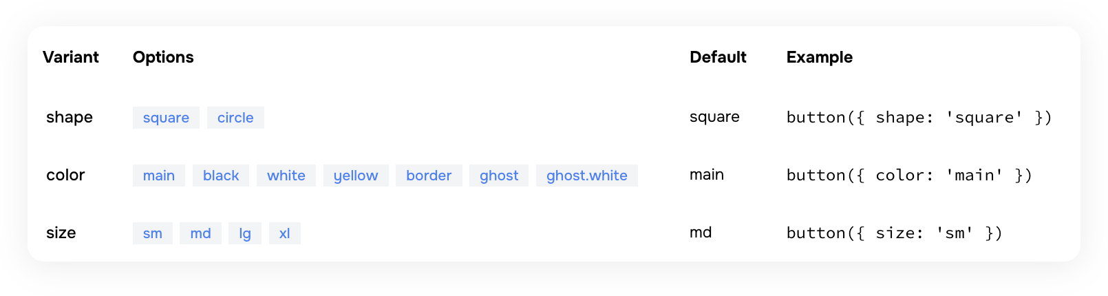
}Your button recipe documentation should look similar to this:
color-palette.json
Contains a list of all color names defined in your palette.
values— an array of color keys (e.g.,"blue","teal","pink"and more).- Does not contain the color scales (e.g., 500, 600); it only lists the available palette names.
- Optional examples:
functionExamplesandjsxExamples
text-styles.json
Structure
This file contains an array of text style definitions for typography presets.
{
  "type": "text-styles",
  "data": [
    {
      "name": "xl",
      "functionExamples": ["css({ textStyle: 'xl' })"],
      "jsxExamples": ["<Box textStyle='xl' />"]
    }
  ]
}
Each text style in the data array includes:
- name: the text style name (e.g.,
xs,sm,md,lg,xl,2xl) - functionExamples: examples of how to use the text style in the
cssfunction - jsxExamples: examples of how to use the text style in JSX
Usage
Here's an example of how to document text styles with a visual preview:
import textStyles from 'styled-system/specs/text-styles.json'

const Demo = () => {
  return (
    <div>
      {textStyles.data.map(style => (
        <div key={style.name}>
          <span className={css({ textStyle: style.name })}>{style.name}</span>
          <p>The quick brown fox jumps over the lazy dog</p>
        </div>
      ))}
    </div>
  )
}
layer-styles.json
Structure
This file contains an array of layer style definitions for visual presets (backgrounds, shadows, borders, etc.).
{
  "type": "layer-styles",
  "data": [
    {
      "name": "offShadow",
      "functionExamples": ["css({ layerStyle: 'offShadow' })"],
      "jsxExamples": ["<Box layerStyle='offShadow' />"]
    }
  ]
}
Each layer style in the data array includes:
- name: the layer style name (e.g.,
card,overlay,offShadow) - functionExamples: examples of how to use the layer style in the
cssfunction - jsxExamples: examples of how to use the layer style in JSX
Usage
Here's an example of how to document layer styles with a visual preview:
import layerStyles from 'styled-system/specs/layer-styles.json'

const Demo = () => {
  return (
    <div>
      {layerStyles.data.map(style => (
        <div key={style.name}>
          <div className={css({ layerStyle: style.name })} />
          <span>{style.name}</span>
        </div>
      ))}
    </div>
  )
}
animation-styles.json
Contains an array of animation style entries. Each entry includes:
name— the animation preset name- Animation properties such as
duration,timingFunction, etc. - Optional examples:
functionExamplesandjsxExamples
If no animation styles are configured in your panda.config.ts file , this file will contain an empty data array.
keyframes.json
Structure
This file contains an array of keyframe definitions for CSS animations.
{
  "type": "keyframes",
  "data": [
    {
      "name": "spin",
      "functionExamples": ["css({ animationName: 'spin' })", "css({ animation: 'spin 1s ease-in-out infinite' })"],
      "jsxExamples": ["<Box animationName='spin' />", "<Box animation='spin 1s ease-in-out infinite' />"]
    }
  ]
}
Each keyframe in the data array includes:
- name: the keyframe name (e.g.,
spin,ping,pulse,bounce,fade-in) - functionExamples: examples of how to use the keyframe in the
cssfunction - jsxExamples: examples of how to use the keyframe in JSX
Usage
Here's an example of how to document keyframes with animated previews:
import keyframes from 'styled-system/specs/keyframes.json'

const Demo = () => {
  return (
    <div>
      {keyframes.data.map(keyframe => (
        <div key={keyframe.name}>
          <div style={{ animation: `${keyframe.name} 1s ease-in-out infinite` }} />
          <span>{keyframe.name}</span>
        </div>
      ))}
    </div>
  )
}
patterns.json
Structure
This file contains an array of pattern definitions for layout utilities.
{
  "type": "patterns",
  "data": [
    {
      "name": "flex",
      "jsx": "Flex",
      "properties": [
        { "name": "align", "type": "SystemProperties['alignItems']" },
        { "name": "justify", "type": "SystemProperties['justifyContent']" },
        { "name": "direction", "type": "SystemProperties['flexDirection']" },
        { "name": "wrap", "type": "SystemProperties['flexWrap']" }
      ],
      "functionExamples": ["flex({ align: 'center' })", "flex({ justify: 'space-between' })"],
      "jsxExamples": ["<Flex align='center' />", "<Flex justify='space-between' />"]
    }
  ]
}
Each pattern in the data array includes:
- name: the pattern function name (e.g.,
flex,grid,stack,center) - jsx: the JSX component name for the pattern (e.g.,
Flex,Grid,Stack) - properties: an array of pattern-specific props, each with:
- name: the prop name (e.g.,
align,justify,gap) - type: the TypeScript type for the prop
- defaultValue: optional default value for the prop
- name: the prop name (e.g.,
- functionExamples: examples of how to use the pattern function
- jsxExamples: examples of how to use the pattern in JSX
Usage
Here's an example of how to document patterns with their properties:
import patterns from 'styled-system/specs/patterns.json'

const Demo = () => {
  return (
    <div>
      {patterns.data.map(pattern => (
        <div key={pattern.name}>
          <h3>{pattern.name}</h3>
          <span>
            {'<'}
            {pattern.jsx} {'/'}
            {'>'}
          </span>
          {pattern.properties.length > 0 && (
            <table>
              <thead>
                <tr>
                  <th>Prop</th>
                  <th>Type</th>
                  <th>Default</th>
                </tr>
              </thead>
              <tbody>
                {pattern.properties.map(prop => (
                  <tr key={prop.name}>
                    <td>{prop.name}</td>
                    <td>{prop.type}</td>
                    <td>{prop.defaultValue || '—'}</td>
                  </tr>
                ))}
              </tbody>
            </table>
          )}
        </div>
      ))}
    </div>
  )
}
conditions.json
Contains an array of condition entries. Each entry includes:
name— the condition key used in style objects (e.g.,_hover,_focus,_focusWithin)value— the CSS selector or media query that the condition maps to- Optional examples:
functionExamplesandjsxExamples
FAQs
Can I edit the spec files directly?
No. The spec files are generated files—you should not edit your design tokens, recipes, or theme directly in
these files. All configuration changes must be made in your panda.config.ts file. The spec files exist purely for
documentation and visualization purposes.