# Panda CSS Theming
> This document contains all theming documentation for Panda CSS
## Table of Contents
- [Animation Styles](#animation-styles)
- [Layer Styles](#layer-styles)
- [Spec](#spec)
- [Using Panda Studio](#using-panda-studio)
- [Text Styles](#text-styles)
- [Tokens](#tokens)
- [Using Tokens](#using-tokens)
---
## Animation Styles
Define reusable animation css properties.
Animation styles focus solely on animations, allowing you to orchestrate animation properties.
## Defining Animation Styles
Animation styles are defined in the `animationStyles` property of the theme.
Here's an example of an animation style:
```js filename="animation-styles.ts"
import { defineAnimationStyles } from '@pandacss/dev'
export const animationStyles = defineAnimationStyles({
'slide-fade-in': {
value: {
transformOrigin: 'var(--transform-origin)',
animationDuration: 'fast',
'&[data-placement^=top]': {
animationName: 'slide-from-top, fade-in'
},
'&[data-placement^=bottom]': {
animationName: 'slide-from-bottom, fade-in'
},
'&[data-placement^=left]': {
animationName: 'slide-from-left, fade-in'
},
'&[data-placement^=right]': {
animationName: 'slide-from-right, fade-in'
}
}
}
})
```
> **Good to know:** The `value` property maps to style objects that will be applied to the element.
## Update the Config
To use the animation styles, we need to update the `config` object in the `panda.config.ts` file.
```js filename="panda.config.ts"
import { defineConfig } from '@pandacss/dev'
import { animationStyles } from './animation-styles'
export default defineConfig({
theme: {
extend: {
animationStyles
}
}
})
```
This should automatically update the generated theme with the specified `animationStyles`. If this doesn't happen, you
can run the `panda codegen` command.
## Using Animation Styles
Now we can use the `animationStyle` property in our components.
```jsx
import { css } from '../styled-system/css'
function App() {
return (
This is an element with slide-fade-in animation style.
)
}
```
Take advantage of it in your conditions:
```ts
export const popoverSlotRecipe = defineSlotRecipe({
slots: anatomy.keys(),
base: {
content: {
_open: {
animationStyle: 'scale-fade-in'
},
_closed: {
animationStyle: 'scale-fade-out'
}
}
}
})
```
## Nesting animation styles
Animation styles support nested structures with a special `DEFAULT` key. This allows you to create variants of an
animation style while having a default fallback.
When you define a `DEFAULT` key within a nested animation style, you can reference the parent key directly to use the
default value.
```js filename="panda.config.ts"
export default defineConfig({
theme: {
extend: {
animationStyles: {
fade: {
DEFAULT: {
value: {
animationName: 'fade-in',
animationDuration: '300ms',
animationTimingFunction: 'ease-in-out'
}
},
slow: {
value: {
animationName: 'fade-in',
animationDuration: '600ms',
animationTimingFunction: 'ease-in-out'
}
},
fast: {
value: {
animationName: 'fade-in',
animationDuration: '150ms',
animationTimingFunction: 'ease-in-out'
}
}
}
}
}
}
})
```
Now you can use the default fade animation or specific speed variants:
```jsx
import { css } from '../styled-system/css'
function App() {
return (
Default fade speed
Slow fade
Fast fade
)
}
```
## Best Practices
### Avoid Overuse
To ensure the performance and readability of your design system, avoid overusing animations. Use them sparingly to
enhance user experience without overwhelming the user.
### Consistent Naming Conventions
We recommend using consistent naming conventions for animation styles. Here are common ideas on how to name animation
styles:
- Based on the type of animation (`slide`, `fade`, `bounce`)
- Based on the direction or trigger (`slide-from-top`, `fade-in`, `bounce-on-click`)
- Descriptive or functional names that explain the style's intended use (`modal-open`, `button-hover`, `alert-show`)
By following these guidelines, you can create a clear and maintainable animation system in your design.
---
## Layer Styles
Define reusable container styles properties.
Layer styles provide a way to create consistent and visually appealing elements.
- Color or text color
- Background color
- Border width and border color
- Box shadow
- Opacity
## Defining layer styles
Layer styles are defined in the `layerStyles` property of the theme.
Here's an example of a layer style:
```js filename="layer-styles.ts"
import { defineLayerStyles } from '@pandacss/dev'
const layerStyles = defineLayerStyles({
container: {
description: 'container styles',
value: {
background: 'gray.50',
border: '2px solid',
borderColor: 'gray.500'
}
}
})
```
> **Good to know:** The `value` property maps to style objects that will be applied to the element.
## Update the config
To use the layer styles, we need to update the `config` object in the `panda.config.ts` file.
```js filename="panda.config.ts"
import { defineConfig } from '@pandacss/dev'
import { layerStyles } from './layer-styles'
export default defineConfig({
theme: {
extend: {
layerStyles
}
}
})
```
This should automatically update the generated theme the specified `layerStyles`. If this doesn't happen, you can run
the `panda codegen` command.
## Using layer styles
Now we can use `layerStyle` property in our components.
```jsx
import { css } from '../styled-system/css'
function App() {
return
This is inside a container style
}
```
## Nesting layer styles
Layer styles support nested structures with a special `DEFAULT` key. This allows you to create variants of a layer style
while having a default fallback.
When you define a `DEFAULT` key within a nested layer style, you can reference the parent key directly to use the
default value.
```js filename="panda.config.ts"
export default defineConfig({
theme: {
extend: {
layerStyles: {
card: {
DEFAULT: {
value: {
background: 'white',
border: '1px solid',
borderColor: 'gray.200',
borderRadius: 'md',
boxShadow: 'sm'
}
},
elevated: {
value: {
background: 'white',
border: 'none',
borderRadius: 'lg',
boxShadow: 'lg'
}
},
outlined: {
value: {
background: 'transparent',
border: '2px solid',
borderColor: 'gray.300',
borderRadius: 'md',
boxShadow: 'none'
}
}
}
}
}
}
})
```
Now you can use the default card style or specific variants:
```jsx
import { css } from '../styled-system/css'
function App() {
return (
Default card style
Elevated card
Outlined card
)
}
```
---
## Spec
Document your design system in Panda.
A spec is a readable JSON representation of the theme structure in your panda config. They're designed to be used for
**documentation purposes** in your own docs websites and Storybook. Some common use cases:
- Document tokens in your theme (colors, spacing, fonts, etc.)
- Showcase the recipes and slot recipes (include their variants and default variants)
- Document the typography styles and layer styles
## Spec Command
To create the spec files, run the following command in your terminal:
```bash
pnpm panda spec
```
Learn more about the spec CLI flags [here](/docs/references/cli#spec)
## Spec Output
The spec command generates a set of JSON files that represent your entire design system. Here's an example of the output
structure:
```sh
styled-system/
└── specs/ # Generated documentation-ready spec files
├── animation-styles.json # Animation style presets (empty if none defined)
├── color-palette.json # List of palette names (blue, teal, etc.)
├── conditions.json # Condition selectors (_hover, _focus, ...)
├── keyframes.json # Keyframe definitions (spin, ping, ...)
├── layer-styles.json # Layer style definitions (card, overlay, ...)
├── patterns.json # Pattern definitions + their properties
├── recipes.json # Component recipes + variants + defaults
├── semantic-tokens.json # Semantic tokens with conditions (base, dark, etc.)
├── text-styles.json # Text style definitions (xs, sm, md, ...)
└── tokens.json # Raw design tokens grouped by category
```
Below is a breakdown of what each file contains and how it can be used.
### `tokens.json`
#### Structure
This file contains an array of raw design tokens grouped by category
```json
{
"type": "tokens",
"data": [
{
"type": "colors",
"values": [
{
"name": "purple.800",
"value": "#6b21a8",
"cssVar": "var(--colors-purple-800)"
}
],
"tokenFunctionExamples": ["token('colors.purple.800')", "token.var('colors.purple.800')"],
"functionExamples": ["css({ color: 'purple.800' })"],
"jsxExamples": [""]
}
]
}
```
Each token in the `values` array includes:
- **name**: token key (e.g., 2xs, md, primary)
- **value**: resolved CSS value (e.g., "1rem", "#F6E458")
- **cssVar**: the generated CSS custom property
- **tokenFunctionExamples**: examples of how to use the token in the `token` function
- **functionExamples**: examples of how to use the token in the `css` function
- **jsxExamples**: examples of how to use the token in JSX
#### Usage
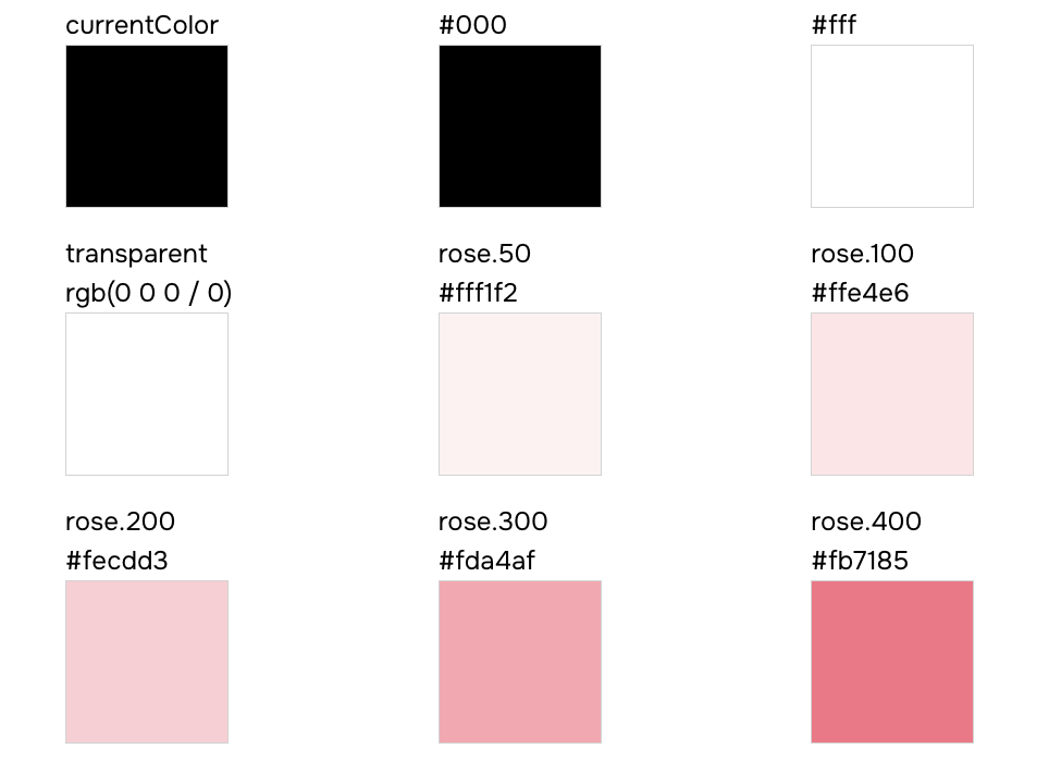
Here's an example of how to document color tokens:
```tsx
import { grid } from 'styled-system/patterns'
import tokens from 'styled-system/specs/tokens.json'
const Demo = () => {
const colors = tokens.data.find(token => token.type === 'colors')
return (
{colors?.values.map(color => (
{color.name}
{color.value}
))}
)
}
```
Your color token documentation should look similar to this:
### `semantic-tokens.json`
#### Structure
This file contains an array of semantic token definitions grouped by category, with conditional values for different
modes (e.g., light/dark).
```json
{
"type": "semantic-tokens",
"data": [
{
"type": "colors",
"values": [
{
"name": "bg",
"values": [
{ "value": "{colors.white}", "condition": "base" },
{ "value": "{colors.dark}", "condition": "dark" }
],
"cssVar": "var(--colors-bg)"
}
],
"tokenFunctionExamples": ["token('colors.bg')", "token.var('colors.bg')"],
"functionExamples": ["css({ color: 'bg' })"],
"jsxExamples": [""]
}
]
}
```
Each semantic token in the `values` array includes:
- **name**: the semantic token key (e.g., `bg`, `fg.muted`, `accent`)
- **values**: an array of conditional mappings, each with:
- **value**: the resolved token reference (e.g., `{colors.white}`)
- **condition**: the condition name (e.g., `base`, `dark`)
- **cssVar**: the generated CSS custom property
- **tokenFunctionExamples**: examples of how to use the token in the `token` function
- **functionExamples**: examples of how to use the token in the `css` function
- **jsxExamples**: examples of how to use the token in JSX
#### Usage
Here's an example of how to document semantic color tokens with their conditional values:
```tsx
import semanticTokens from 'styled-system/specs/semantic-tokens.json'
const Demo = () => {
const colors = semanticTokens.data.find(token => token.type === 'colors')
return (
{colors?.values.map(token => (
{token.name}
{token.cssVar}
{token.values.map(({ condition, value }) => (
{condition}
{value}
))}
))}
)
}
```
### `recipes.json`
#### Structure
This file contains an array of recipe definitions for styling components with variant support.
```json
{
"type": "recipes",
"data": [
{
"name": "button",
"description": "A button style",
"variants": {
"shape": ["square", "circle"],
"color": ["main", "black", "white"],
"size": ["sm", "md", "lg"]
},
"defaultVariants": {
"shape": "square",
"color": "main",
"size": "md"
},
"functionExamples": ["button({ shape: 'square' })", "button({ color: 'main' })", "button({ size: 'sm' })"],
"jsxExamples": ["", "", ""]
}
]
}
```
Each recipe in the `data` array includes:
- **name**: the recipe name (e.g., `button`, `card`)
- **description**: optional description of what the recipe does
- **variants**: an object where each key is a variant name and each value is an array of allowed options
- **defaultVariants**: an object defining the default option for each variant
- **functionExamples**: examples of how to use the recipe function
- **jsxExamples**: examples of how to use the recipe in JSX
#### Usage
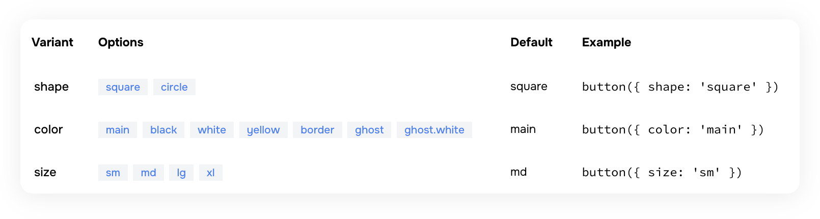
Here's an example of how to document a button recipe within a table:
```tsx
import recipes from 'styled-system/specs/recipes.json'
const Demo = () => {
const buttonRecipe = recipes.data.find(recipe => recipe.name === 'button')
const defaultVariants = buttonRecipe?.defaultVariants || {}
return (
{(options as string[]).map(option => (
{option}
))}
{defaultVariants[key as keyof typeof defaultVariants] || 'none'}
))}
)
}
```
Your button recipe documentation should look similar to this:
### `color-palette.json`
Contains a list of all color names defined in your palette.
- `values` — an array of color keys (e.g., `"blue"`, `"teal"`, `"pink"` and more).
- Does not contain the color scales (e.g., 500, 600); it only lists the available palette names.
- Optional examples: `functionExamples` and `jsxExamples`
### `text-styles.json`
#### Structure
This file contains an array of text style definitions for typography presets.
```json
{
"type": "text-styles",
"data": [
{
"name": "xl",
"functionExamples": ["css({ textStyle: 'xl' })"],
"jsxExamples": [""]
}
]
}
```
Each text style in the `data` array includes:
- **name**: the text style name (e.g., `xs`, `sm`, `md`, `lg`, `xl`, `2xl`)
- **functionExamples**: examples of how to use the text style in the `css` function
- **jsxExamples**: examples of how to use the text style in JSX
#### Usage
Here's an example of how to document text styles with a visual preview:
```tsx
import textStyles from 'styled-system/specs/text-styles.json'
const Demo = () => {
return (
{textStyles.data.map(style => (
{style.name}
The quick brown fox jumps over the lazy dog
))}
)
}
```
### `layer-styles.json`
#### Structure
This file contains an array of layer style definitions for visual presets (backgrounds, shadows, borders, etc.).
```json
{
"type": "layer-styles",
"data": [
{
"name": "offShadow",
"functionExamples": ["css({ layerStyle: 'offShadow' })"],
"jsxExamples": [""]
}
]
}
```
Each layer style in the `data` array includes:
- **name**: the layer style name (e.g., `card`, `overlay`, `offShadow`)
- **functionExamples**: examples of how to use the layer style in the `css` function
- **jsxExamples**: examples of how to use the layer style in JSX
#### Usage
Here's an example of how to document layer styles with a visual preview:
```tsx
import layerStyles from 'styled-system/specs/layer-styles.json'
const Demo = () => {
return (
{layerStyles.data.map(style => (
{style.name}
))}
)
}
```
### `animation-styles.json`
Contains an array of animation style entries. Each entry includes:
- `name` — the animation preset name
- Animation properties such as `duration`, `timingFunction`, etc.
- Optional examples: `functionExamples` and `jsxExamples`
If no animation styles are configured in your `panda.config.ts` file , this file will contain an empty data array.
### `keyframes.json`
#### Structure
This file contains an array of keyframe definitions for CSS animations.
```json
{
"type": "keyframes",
"data": [
{
"name": "spin",
"functionExamples": ["css({ animationName: 'spin' })", "css({ animation: 'spin 1s ease-in-out infinite' })"],
"jsxExamples": ["", ""]
}
]
}
```
Each keyframe in the `data` array includes:
- **name**: the keyframe name (e.g., `spin`, `ping`, `pulse`, `bounce`, `fade-in`)
- **functionExamples**: examples of how to use the keyframe in the `css` function
- **jsxExamples**: examples of how to use the keyframe in JSX
#### Usage
Here's an example of how to document keyframes with animated previews:
```tsx
import keyframes from 'styled-system/specs/keyframes.json'
const Demo = () => {
return (
{keyframes.data.map(keyframe => (
{keyframe.name}
))}
)
}
```
### `patterns.json`
#### Structure
This file contains an array of pattern definitions for layout utilities.
```json
{
"type": "patterns",
"data": [
{
"name": "flex",
"jsx": "Flex",
"properties": [
{ "name": "align", "type": "SystemProperties['alignItems']" },
{ "name": "justify", "type": "SystemProperties['justifyContent']" },
{ "name": "direction", "type": "SystemProperties['flexDirection']" },
{ "name": "wrap", "type": "SystemProperties['flexWrap']" }
],
"functionExamples": ["flex({ align: 'center' })", "flex({ justify: 'space-between' })"],
"jsxExamples": ["", ""]
}
]
}
```
Each pattern in the `data` array includes:
- **name**: the pattern function name (e.g., `flex`, `grid`, `stack`, `center`)
- **jsx**: the JSX component name for the pattern (e.g., `Flex`, `Grid`, `Stack`)
- **properties**: an array of pattern-specific props, each with:
- **name**: the prop name (e.g., `align`, `justify`, `gap`)
- **type**: the TypeScript type for the prop
- **defaultValue**: optional default value for the prop
- **functionExamples**: examples of how to use the pattern function
- **jsxExamples**: examples of how to use the pattern in JSX
#### Usage
Here's an example of how to document patterns with their properties:
```tsx
import patterns from 'styled-system/specs/patterns.json'
const Demo = () => {
return (
)
}
```
### `conditions.json`
Contains an array of condition entries. Each entry includes:
- `name` — the condition key used in style objects (e.g.,`_hover`, `_focus`, `_focusWithin`)
- `value` — the CSS selector or media query that the condition maps to
- Optional examples: `functionExamples` and `jsxExamples`
## FAQs
### Can I edit the spec files directly?
**No.** The spec files are **generated** files—you should **not** edit your design tokens, recipes, or theme directly in
these files. All configuration changes must be made in your `panda.config.ts` file. The spec files exist purely for
documentation and visualization purposes.
---
## Using Panda Studio
Document your design system visually using Panda Studio.
### Panda Studio
Panda Studio is a visual interface for exploring and understanding your entire design system. It provides a read-only
view of your tokens, semantic tokens, recipes, patterns, conditions, and more.
If you don't want to manually generate spec files or build a documentation website, Panda Studio is the easiest option.
- Studio does not require you to run pnpm panda spec.
- Studio generates and visualizes your design system automatically.
- Studio acts as a fully-featured documentation tool without writing any documentation code.
> Spec files are primarily for custom documentation setups and Storybook integrations. Panda Studio is for teams who
> want instant documentation.
## Panda Studio Setup
To use panda studio, first install it:
```bash
pnpm i @pandacss/studio
```
Next, launch it locally using:
```bash
pnpm panda studio
```
This starts a local server and launches an interactive dashboard showing all your design system elements. Since Studio
reads your theme configuration directly, any changes to your `panda.config.ts` will appear automatically the next time
you run it.
You can also deploy the studio as a standalone design system portal for your team.
---
## Text Styles
Define reusable typography css properties.
Text styles allows you to define textual css properties. The common properties are:
- The font family, weight, size
- Line height
- Letter spacing
- Text Decoration (strikethrough and underline)
- Text Transform (uppercase, lowercase, and capitalization)
## Defining text styles
Text styles are defined in the `textStyles` property of the theme.
Here's an example of a text style:
```js filename="text-styles.ts"
import { defineTextStyles } from '@pandacss/dev'
export const textStyles = defineTextStyles({
body: {
description: 'The body text style - used in paragraphs',
value: {
fontFamily: 'Inter',
fontWeight: '500',
fontSize: '16px',
lineHeight: '24px',
letterSpacing: '0',
textDecoration: 'None',
textTransform: 'None'
}
}
})
```
> **Good to know:** The `value` property maps to style objects that will be applied to the text.
## Update the config
To use the text styles, we need to update the `config` object in the `panda.config.ts` file.
```js filename="panda.config.ts"
import { defineConfig } from '@pandacss/dev'
import { textStyles } from './text-styles'
export default defineConfig({
theme: {
extend: {
textStyles
}
}
})
```
This should automatically update the generated theme the specified `textStyles`. If this doesn't happen, you can run the
`panda codegen` command.
## Using text styles
Now we can use `textStyle` property in our components.
```jsx
import { css } from '../styled-system/css'
function App() {
return
This is a paragraph from Panda with the body text style.
}
```
## Nesting text styles
Text styles support nested structures with a special `DEFAULT` key. This allows you to create variants of a text style
while having a default fallback.
When you define a `DEFAULT` key within a nested text style, you can reference the parent key directly to use the default
value.
```js filename="panda.config.ts"
export default defineConfig({
theme: {
extend: {
textStyles: {
heading: {
DEFAULT: {
value: {
fontFamily: 'Inter',
fontWeight: 'bold',
fontSize: '1.5rem',
lineHeight: '1.2'
}
},
h1: {
value: {
fontFamily: 'Inter',
fontWeight: 'bold',
fontSize: '2.5rem',
lineHeight: '1.1'
}
},
h2: {
value: {
fontFamily: 'Inter',
fontWeight: 'bold',
fontSize: '2rem',
lineHeight: '1.15'
}
}
}
}
}
}
})
```
Now you can use the default heading style or specific variants:
```jsx
import { css } from '../styled-system/css'
function App() {
return (
Main Title
Subtitle
Uses DEFAULT variant
)
}
```
## Best Practices
### Avoid layout properties
To ensure the consistency of your design system, avoid applying layout properties (like margin, padding, etc.) or color
properties (background, colors, etc.) to the text styles.
### Naming conventions
We recommend using the same text style names used by designers on your team. Here are common ideas on how to name text
styles:
- Sized-based naming system (`xs`, `sm`, `md`, `lg`, `xl`)
- Semantic naming system that corresponds to respective html tags in production (`caption`, `paragraph`, `h1`, `h2`)
- Descriptive or functional naming system that explains the style's intended use (`alert`, `modal-header`,
`button-label`)
---
## Tokens
Design tokens are the platform-agnostic way to manage design decisions in your application or website.
Design tokens provide a platform-agnostic way to manage design decisions through key-value pairs that describe
fundamental visual styles.
> Design tokens in Panda are largely influenced by the [W3C Token Format](https://tr.designtokens.org/format/).
A design token consists of the following properties:
- `value`: The value of the token. This can be any valid CSS value.
- `description`: An optional description of what the token can be used for.
## Core Tokens
Tokens are defined in the `panda.config` file under the `theme` key
```js filename="panda.config.ts"
import { defineConfig } from '@pandacss/dev'
export default defineConfig({
theme: {
// 👇🏻 Define your tokens here
extend: {
tokens: {
colors: {
primary: { value: '#0FEE0F' },
secondary: { value: '#EE0F0F' }
},
fonts: {
body: { value: 'system-ui, sans-serif' }
}
}
}
}
})
```
> ⚠️ Token values need to be nested in an object with a `value` key. This is to allow for additional properties like
> `description` and more in the future.
After defining tokens, you can use them in authoring components and styles.
```jsx
import { css } from '../styled-system/css'
function App() {
return (
Hello World
)
}
```
You can also add an optional description to your tokens. This will be used in the autogenerate token documentation.
```js {8}
import { defineConfig } from '@pandacss/dev'
export default defineConfig({
theme: {
tokens: {
colors: {
danger: {
value: '#EE0F0F',
description: 'Color for errors'
}
}
}
}
})
```
## Semantic Tokens
Semantic tokens are tokens that are designed to be used in a specific context. In most cases, the value of a semantic
token references to an existing token.
> To reference a value in a semantic token, use the `{}` syntax.
For example, assuming we've defined the following tokens:
- `red` and `green` are raw tokens that define the color red and green.
- `danger` and `success` are semantic tokens that reference the `red` and `green` tokens.
```js
import { defineConfig } from '@pandacss/dev'
export default defineConfig({
theme: {
tokens: {
colors: {
red: { value: '#EE0F0F' },
green: { value: '#0FEE0F' }
}
},
semanticTokens: {
colors: {
danger: { value: '{colors.red}' },
success: { value: '{colors.green}' }
}
}
}
})
```
> ⚠️ Semantic Token values need to be nested in an object with a `value` key. This is to allow for additional properties
> like `description` and more in the future.
Semantic tokens can also be changed based on the [conditions](/docs/concepts/conditional-styles) like light and dark
modes.
For example, if you want a color to change automatically based on light or dark mode.
```js
import { defineConfig } from '@pandacss/dev'
export default defineConfig({
// ...
theme: {
semanticTokens: {
colors: {
danger: {
value: { base: '{colors.red}', _dark: '{colors.darkred}' }
},
success: {
value: { base: '{colors.green}', _dark: '{colors.darkgreen}' }
}
}
}
}
})
```
> NOTE 🚨: The conditions used in semantic tokens must be an at-rule or parent selector
> [condition](/docs/concepts/conditional-styles#reference).
## Token Nesting
Tokens can be nested to create a hierarchy of tokens. This is useful when you want to group tokens together.
> Tip: You can use the `DEFAULT` key to define the default value of a nested token.
```js
import { defineConfig } from '@pandacss/dev'
export default defineConfig({
// ...
theme: {
semanticTokens: {
colors: {
bg: {
DEFAULT: { value: '{colors.gray.100}' },
muted: { value: '{colors.gray.100}' }
}
}
}
}
})
```
This allows the use of the `bg` token in the following ways:
```jsx
import { css } from '../styled-system/css'
function App() {
return (
Hello World
)
}
```
## Token Types
Panda supports the following token types:
### Colors
Colors have meaning and support the purpose of the content, communicating things like hierarchy of information, and
states. It is mostly defined as a string value or reference to other tokens.
```jsx
const theme = {
tokens: {
colors: {
red: { 100: { value: '#fff1f0' } }
}
}
}
```
### Gradients
Gradient tokens represent a smooth transition between two or more colors. Its value can be defined as a string or a
composite value.
```ts
type Gradient =
| string
| {
type: 'linear' | 'radial'
placement: string | number
stops:
| Array<{
color: string
position: number
}>
| Array
}
```
```jsx
const theme = {
tokens: {
gradients: {
// string value
simple: { value: 'linear-gradient(to right, red, blue)' },
// composite value
primary: {
value: {
type: 'linear',
placement: 'to right',
stops: ['red', 'blue']
}
}
}
}
}
```
### Sizes
Size tokens represent the width and height of an element. Its value is defined as a string.
```jsx
const theme = {
tokens: {
sizes: {
sm: { value: '12px' }
}
}
}
```
> Size tokens are typically used in `width`, `height`, `min-width`, `max-width`, `min-height`, `max-height` properties.
### Spacings
Spacing tokens represent the margin and padding of an element. Its value is defined as a string.
```jsx
const theme = {
tokens: {
spacing: {
sm: { value: '12px' }
}
}
}
```
> Spacing tokens are typically used in `margin`, `padding`, `gap`, and `{top|right|bottom|left}` properties.
### Fonts
Font tokens represent the font family of a text element. Its value is defined as a string or an array of strings.
```jsx
const theme = {
tokens: {
fonts: {
body: { value: 'Inter, sans-serif' },
heading: { value: ['Roboto Mono', 'sans-serif'] }
}
}
}
```
> Font tokens are typically used in `font-family` property.
### Font Sizes
Font size tokens represent the size of a text element. Its value is defined as a string.
```jsx
const theme = {
tokens: {
fontSizes: {
sm: { value: '12px' }
}
}
}
```
> Font size tokens are typically used in `font-size` property.
### Font Weights
Font weight tokens represent the weight of a text element. Its value is defined as a string.
```jsx
const theme = {
tokens: {
fontWeights: {
bold: { value: '700' }
}
}
}
```
> Font weight tokens are typically used in `font-weight` property.
### Letter Spacings
Letter spacing tokens represent the spacing between letters in a text element. Its value is defined as a string.
```jsx
const theme = {
tokens: {
letterSpacings: {
wide: { value: '0.1em' }
}
}
}
```
> Letter spacing tokens are typically used in `letter-spacing` property.
### Line Heights
Line height tokens represent the height of a line of text. Its value is defined as a string.
```jsx
const theme = {
tokens: {
lineHeights: {
normal: { value: '1.5' }
}
}
}
```
> Line height tokens are typically used in `line-height` property.
### Radii
Radii tokens represent the radius of a border. Its value is defined as a string.
```jsx
const theme = {
tokens: {
radii: {
sm: { value: '4px' }
}
}
}
```
> Radii tokens are typically used in `border-radius` property.
### Borders
A border is a line surrounding a UI element. You can define them as string values or as a composite value
```jsx
const theme = {
tokens: {
borders: {
// string value
subtle: { value: '1px solid red' },
// string value with reference to color token
danger: { value: '1px solid {colors.red.400}' },
// composite value
accent: { value: { width: '1px', color: 'red', style: 'solid' } }
}
}
}
```
> Border tokens are typically used in `border`, `border-top`, `border-right`, `border-bottom`, `border-left`, `outline`
> properties.
### Border Widths
Border width tokens represent the width of a border. Its value is defined as a string.
```jsx
const theme = {
tokens: {
borderWidths: {
thin: { value: '1px' },
thick: { value: '2px' },
medium: { value: '1.5px' }
}
}
}
```
### Shadows
Shadow tokens represent the shadow of an element. Its value is defined as single or multiple values containing a string
or a composite value.
```ts
type CompositeShadow = {
offsetX: number
offsetY: number
blur: number
spread: number
color: string
inset?: boolean
}
type Shadow = string | CompositeShadow | string[] | CompositeShadow[]
```
```jsx
const theme = {
tokens: {
shadows: {
// string value
subtle: { value: '0 1px 2px 0 rgba(0, 0, 0, 0.05)' },
// composite value
accent: {
value: {
offsetX: 0,
offsetY: 4,
blur: 4,
spread: 0,
color: 'rgba(0, 0, 0, 0.1)'
}
},
// multiple string values
realistic: {
value: ['0 1px 2px 0 rgba(0, 0, 0, 0.05)', '0 1px 4px 0 rgba(0, 0, 0, 0.1)']
}
}
}
}
```
> Shadow tokens are typically used in `box-shadow` property.
### Easings
Easing tokens represent the easing function of an animation or transition. Its value is defined as a string or an array
of values representing the cubic bezier.
```jsx
const theme = {
tokens: {
easings: {
// string value
easeIn: { value: 'cubic-bezier(0.4, 0, 0.2, 1)' },
// array value
easeOut: { value: [0.4, 0, 0.2, 1] }
}
}
}
```
> Ease tokens are typically used in `transition-timing-function` property.
### Opacity
Opacity tokens help you set the opacity of an element.
```js
const theme = {
tokens: {
opacity: {
50: { value: 0.5 }
}
}
}
```
> Opacity tokens are typically used in `opacity` property.
### Z-Index
This token type represents the depth of an element's position on the z-axis.
```jsx
const theme = {
tokens: {
zIndex: {
modal: { value: 1000 }
}
}
}
```
> Z-index tokens are typically used in `z-index` property.
### Assets
Asset tokens represent a url or svg string. Its value is defined as a string or a composite value.
```ts
type CompositeAsset = { type: 'url' | 'svg'; value: string }
type Asset = string | CompositeAsset
```
```js
const theme = {
tokens: {
assets: {
logo: {
value: { type: 'url', value: '/static/logo.png' }
},
checkmark: {
value: { type: 'svg', value: '' }
}
}
}
}
```
> Asset tokens are typically used in `background-image` property.
### Durations
Duration tokens represent the length of time in milliseconds an animation or animation cycle takes to complete. Its
value is defined as a string.
```jsx
const theme = {
tokens: {
durations: {
fast: { value: '100ms' }
}
}
}
```
> Duration tokens are typically used in `transition-duration` and `animation-duration` properties.
### Animations
Animation tokens represent a keyframe animation. Its value is defined as a string value.
```jsx
const theme = {
tokens: {
animations: {
spin: {
value: 'spin 1s linear infinite'
}
}
}
}
```
> Animation tokens are typically used in `animation` property.
### Aspect Ratios
Aspect ratio tokens represent the aspect ratio of an element. Its value is defined as a string.
```js
const theme = {
tokens: {
aspectRatios: {
'1:1': { value: '1 / 1' },
'16:9': { value: '16 / 9' }
}
}
}
```
### Cursor
Cursor tokens define the style of the mouse pointer when it hovers over a specific element or area. These tokens
represent the visual behavior of interactions, indicating actions such as clickable areas, draggable elements, or
loading states. Their value is defined as a string.
```js
const theme = {
tokens: {
cursor: {
click: { value: 'pointer' },
disabled: { value: 'not-allowed' },
// custom value
custom: { value: 'url(cursor.svg), auto' }
}
}
}
```
## Token Helpers
To help defining tokens in a type-safe way, you can use the tokens
[Config Functions](/docs/customization/config-functions#token-creators).
## CSS variables
The generated CSS variables will be scoped using the `cssVarRoot` selector defined in the config.
```js
import { defineConfig } from '@pandacss/dev'
export default defineConfig({
cssVarRoot: ':where(:root, :host)'
// ...
})
```
This will generate a CSS file similar to the following:
```css
:where(:root, :host) {
--colors-primary: #0fee0f;
--colors-secondary: #ee0f0f;
/* ... */
}
```
You can also define type-safe CSS variables using [globalVars](/docs/concepts/writing-styles#property-conflicts).
---
## Using Tokens
There are various ways to consume Panda tokens depending on your need at that point in time.
Learn the various ways to consume Panda tokens in your project.
## Style Properties
The recommended way to consume your tokens is in the `css` function or style props.
```jsx
import { css } from '../styled-system/css'
const App = () => (
)
```
## Composite values
Some CSS properties like `border`, `box-shadow` allow you to specify multiple properties in its value. Panda allows you
to reference tokens in these composite values by using either the `token()` string function (similar to the JS
equivalent) or the token reference syntax `{path.to.token}` (similar to the semantic tokens equivalent).
The `token()` function is useful when you need to provide a fallback value. The token reference syntax is useful when
you don't need a fallback value or prefer using a more concise syntax.
{/* */}
```js
import { css } from '../styled-system/css'
const className = css({ border: '1px solid token(colors.red.400)' })
```
You can also provide a fallback value.
```js
import { css } from '../styled-system/css'
const className = css({ border: '1px solid token(colors.red.400, red)' })
```
```js
import { css } from '../styled-system/css'
const className = css({ border: '1px solid {colors.red.400}' })
```
{/* */}
You can also use it in media queries or any other CSS at-rule.
{/* */}
```js
import { css } from '../styled-system/css'
const className = css({
'@media screen and (min-width: token(sizes.4xl))': {
color: 'green.400'
}
})
```
```js
import { css } from '../styled-system/css'
const className = css({
'@media screen and (min-width: {sizes.4xl})': {
color: 'green.400'
}
})
```
{/* */}
## Vanilla JS
Use the generated `token` function to query design tokens in your project. This is useful if you need direct access to
your design tokens in the `style` attribute or when using CSS-in-JS libraries like `styled-components` or
`@emotion/styled`
> This approach is useful for incrementally adopting Panda in existing projects or
> [dynamic styling](/docs/guides/dynamic-styling#using-token)
### Style Attribute
```tsx filename="src/App.tsx"
import { token } from '../styled-system/tokens'
function App() {
return (
)
}
```
Each of your design tokens will be available in the generated `/tokens` folder. It looks like this:
```js filename="styled-system/tokens.ts"
const tokens = {
// ...
'colors.blue.200': {
value: '#bfdbfe',
variable: 'var(--colors-blue-200)'
}
// ...
}
```
- The `token()` function returns the raw value of the token.
- The `token.var()` function returns the CSS custom property used to reference the token.
Both functions are typesafe and expect a known dot-separated token path, they also accept a fallback value as a second
argument.
Using the example above, `token('colors.blue.200')` would return `#bfdbfe` and `token.var('colors.blue.200')` would
return `var(--colors-blue-200)`.
### Styled Components
```tsx
import styled from 'styled-components'
const Button = styled.button`
background: ${token('colors.blue.200')};
`
```
### Emotion
```tsx
import styled from '@emotion/styled'
const Button = styled.button`
background: ${token('colors.blue.200')};
`
```
---
_This content is automatically generated from the official Panda CSS documentation._