# Panda CSS Customization
> This document contains all customization documentation for Panda CSS
## Table of Contents
- [Conditions](#conditions)
- [Config Functions](#config-functions)
- [Deprecations](#deprecations)
- [Customizing Patterns](#customizing-patterns)
- [Presets](#presets)
- [Theme](#theme)
- [Utilities](#utilities)
---
## Conditions
Learn how to customize conditions in your Panda config
Conditions allow you to apply different styles and behaviors based on specific conditions or states. They provide a way
to target specific elements or apply styles in response to certain events or conditions.
## Creating a condition
To create a condition, you can use the conditions property in the config. Let's say we want to create a `groupHover`
pseudo condition that applies styles to an element when a parent container with the `group` role is hovered.
```ts filename="panda.config.ts"
import { defineConfig } from '@pandacss/dev'
export default defineConfig({
conditions: {
extend: {
groupHover: '[role=group]:where(:hover, [data-hover]) &'
}
}
})
```
> ⚠️ The `&` character is mandatory, it is a placeholder for the current selector. It will be replaced with the actual
> selector when the condition is used. It has to be used either at the beginning or at the end of the condition.
Then you can run the following command to generate the conditions JS code:
{/* */}
```bash
pnpm panda codegen
```
```bash
npm panda codegen
```
```bash
yarn panda codegen
```
```bash
bun panda codegen
```
{/* */}
Now, we can use the `groupHover` condition in our components.
```jsx
import { css } from '../styled-system/css'
function App() {
return (
)
}
```
## Customizing Built-in Conditions
You can extend the [default conditions](/docs/concepts/conditional-styles#reference) by using the `conditions.extend`
property in the config.
```ts filename="panda.config.ts"
import { defineConfig } from '@pandacss/dev'
export default defineConfig({
conditions: {
extend: {
// Extend the default `dark` condition
dark: '.dark &, [data-theme="dark"] &'
}
}
})
```
Then you can run the following command to update the conditions JS code:
{/* */}
```bash
pnpm panda codegen
```
```bash
npm panda codegen
```
```bash
yarn panda codegen
```
```bash
bun panda codegen
```
{/* */}
## Using tokens
You can also use tokens in your conditions, and they will be resolved to their actual values:
```tsx
import { defineConfig } from '@pandacss/dev'
export default defineConfig({
conditions: {
extend: {
mq: '@media (min-width: token(sizes.4xl))',
size2: '&[data-size=token(spacing.2)]'
}
}
})
```
## Mixed conditions
You can also use mixed conditions (nested at-rules/selectors) under a single condition name:
```tsx
import { defineConfig } from '@pandacss/dev'
export default defineConfig({
conditions: {
extend: {
supportHover: ['@media (hover: hover) and (pointer: fine)', '&:hover']
}
}
})
```
```ts
import { css } from '../styled-system/css'
css({
_supportHover: {
color: 'red'
}
})
```
will generate the following CSS:
```css
@media (hover: hover) and (pointer: fine) {
&:hover {
color: red;
}
}
```
## Multi-block conditions
Sometimes you need a single condition to generate multiple independent CSS blocks, each with its own at-rule. For example, you might want hover feedback on desktop (pointer devices) and active/press feedback on touch devices.
Use the object syntax with `@slot` markers to define multi-block conditions. Each path from the root of the object to a `@slot` value becomes an independent CSS block:
```tsx
import { defineConfig } from '@pandacss/dev'
export default defineConfig({
conditions: {
extend: {
hoverActive: {
'@media (hover: hover)': {
'&:is(:hover, [data-hover])': '@slot',
},
'@media (hover: none)': {
'&:is(:active, [data-active])': '@slot',
},
},
},
},
})
```
```ts
import { css } from '../styled-system/css'
css({
_hoverActive: {
bg: 'red',
},
})
```
will generate the following CSS:
```css
@media (hover: hover) {
.hoverActive\:bg_red:is(:hover, [data-hover]) {
background: red;
}
}
@media (hover: none) {
.hoverActive\:bg_red:is(:active, [data-active]) {
background: red;
}
}
```
This is also useful for any scenario where a single condition needs to apply the same styles across multiple independent at-rule blocks. Objects with a single `@slot` path behave identically to the [mixed conditions](#mixed-conditions) array syntax.
## Container queries
Read more about how to define type-safe container queries [here](/docs/concepts/conditional-styles#container-queries)
## Minimal setup
If you want to use Panda with the bare minimum, without any of the defaults, you can read more about it
[here](/docs/guides/minimal-setup)
---
## Config Functions
Functions to expose types for your config.
Config functions help define and provide type information for your configuration. These utilities enhance code
readability, enforce consistency, and ensure robust type checking.
## Config Creators
To help defining config in a type-safe way, you can use the following helpers:
### `defineConfig`
Function for [config](/docs/references/config) definitions.
```ts filename="panda.config.ts"
import { defineConfig } from '@pandacss/dev'
export default defineConfig({
theme: {},
include: ['src/**/*.{js,jsx,ts,tsx}']
})
```
### `defineRecipe`
Function for [recipe](/docs/concepts/recipes#config-recipe) definitions.
```ts
import { defineRecipe } from '@pandacss/dev'
export const buttonRecipe = defineRecipe({
className: 'button',
description: 'The styles for the Button component',
base: {
display: 'flex'
},
variants: {
visual: {
funky: { bg: 'red.200', color: 'white' },
edgy: { border: '1px solid {colors.red.500}' }
}
},
defaultVariants: {
visual: 'funky',
size: 'sm'
}
})
```
### `defineSlotRecipe`
Function for [slot recipe](/docs/concepts/slot-recipes#config-slot-recipe) definitions.
```ts
import { defineSlotRecipe } from '@pandacss/dev'
export const checkboxRecipe = defineSlotRecipe({
className: 'checkbox',
description: 'The styles for the Checkbox component',
slots: ['root', 'control', 'label'],
base: {
root: { display: 'flex', alignItems: 'center', gap: '2' },
control: { borderWidth: '1px', borderRadius: 'sm' },
label: { marginStart: '2' }
},
variants: {
size: {
sm: {
control: { width: '8', height: '8' },
label: { fontSize: 'sm' }
},
md: {
control: { width: '10', height: '10' },
label: { fontSize: 'md' }
}
}
},
defaultVariants: {
size: 'sm'
}
})
```
### `defineParts`
It can be useful when you want to have the equivalent of a slot recipe without needing to split the class names bindings
and instead just having a className that handles children on 1 DOM element.
It pairs well with [ZagJs](https://zagjs.com/) and [Ark-UI](https://ark-ui.com/)
Let's refactor the previous example to use parts instead of slots:
```ts
import { defineParts, definetRecipe } from '@pandacss/dev'
const parts = defineParts({
root: { selector: '& [data-part="root"]' },
control: { selector: '& [data-part="control"]' },
label: { selector: '& [data-part="label"]' }
})
export const checkboxRecipe = defineRecipe({
className: 'checkbox',
description: 'A checkbox style',
base: parts({
root: { display: 'flex', alignItems: 'center', gap: '2' },
control: { borderWidth: '1px', borderRadius: 'sm' },
label: { marginStart: '2' }
}),
variants: {
size: {
sm: parts({
control: { width: '8', height: '8' },
label: { fontSize: 'sm' }
}),
md: parts({
control: { width: '10', height: '10' },
label: { fontSize: 'md' }
})
}
},
defaultVariants: {
size: 'sm'
}
})
```
### `definePattern`
Function for [pattern](/docs/customization/patterns) definitions.
```ts
import { definePattern } from '@pandacss/dev'
const visuallyHidden = definePattern({
transform(props) {
return {
srOnly: true,
...props
}
}
})
```
### `definePreset`
Function for [preset](/docs/customization/presets#creating-a-preset) definitions.
```ts
import { definePreset } from '@pandacss/dev'
export const pandaPreset = definePreset({
theme: {
extend: {
tokens: {
colors: { primary: { value: 'blue.500' } }
}
}
}
})
```
### `definePlugin`
Function for [plugin](/docs/references/config#plugins) definitions.
```ts
import { definePlugin } from '@pandacss/dev'
export const plugin = definePlugin({
name: 'token-format',
hooks: {
'tokens:created': ({ configure }) => {
configure({
formatTokenName: path => '$' + path.join('-')
})
}
}
})
```
### `defineKeyframes`
Function for [keyframes](/docs/customization/theme#keyframes) definitions.
```ts
import { defineKeyframes } from '@pandacss/dev'
export const keyframes = defineKeyframes({
fadeIn: {
'0%': { opacity: '0' },
'100%': { opacity: '1' }
}
})
```
### `defineGlobalStyles`
Function for [global styles](/docs/concepts/writing-styles#global-styles) definitions.
```ts
import { defineGlobalStyles } from '@pandacss/dev'
const globalCss = defineGlobalStyles({
'html, body': {
color: 'gray.900',
lineHeight: '1.5'
}
})
```
### `defineUtility`
Function for [utility](/docs/customization/utilities) definitions.
```ts
import { defineUtility } from '@pandacss/dev'
export const br = defineUtility({
className: 'rounded',
values: 'radii',
transform(value) {
return { borderRadius: value }
}
})
```
### `defineTextStyles`
Function for [text styles](/docs/theming/text-styles) definitions.
```ts
import { defineTextStyles } from '@pandacss/dev'
export const textStyles = defineTextStyles({
body: {
description: 'The body text style - used in paragraphs',
value: {
fontFamily: 'Inter',
fontWeight: '500',
fontSize: '16px',
lineHeight: '24',
letterSpacing: '0',
textDecoration: 'None',
textTransform: 'None'
}
}
})
```
### `defineLayerStyles`
Function for [layer styles](/docs/theming/layer-styles) definitions.
```ts
import { defineLayerStyles } from '@pandacss/dev'
const layerStyles = defineLayerStyles({
container: {
description: 'container styles',
value: {
background: 'gray.50',
border: '2px solid',
borderColor: 'gray.500'
}
}
})
```
### `defineStyles`
Function for style definitions.
This comes in handy when you want to define reusable styles in the config.
E.g. a set of styles to be used in multiple variants within a [recipe](/docs/concepts/recipes#config-recipe).
```ts {3, 14, 18} filename="recipes/button.ts"
import { defineRecipe, defineStyles } from '@pandacss/dev'
const buttonVisualStyles = defineStyles({
borderRadius: 'lg',
boxShadow: 'sm'
})
export const buttonRecipe = defineRecipe({
// ...
variants: {
visual: {
funky: {
bg: 'red.200',
color: 'white',
...buttonVisualStyles
},
edgy: {
border: '1px solid {colors.red.500}',
...buttonVisualStyles
}
}
}
})
```
## Token Creators
To help defining tokens in a type-safe way, you can use the following helpers:
### `defineTokens`
```ts
import { defineTokens } from '@pandacss/dev'
const theme = {
tokens: defineTokens({
colors: {
primary: { value: '#ff0000' }
}
})
}
```
You can also use this function to define tokens in a separate file:
```ts filename="tokens/colors.ts"
import { defineTokens } from '@pandacss/dev'
export const colors = defineTokens.colors({
primary: { value: '#ff0000' }
})
```
### `defineSemanticTokens`
```ts
import { defineSemanticTokens } from '@pandacss/dev'
const theme = {
semanticTokens: defineSemanticTokens({
colors: {
primary: {
value: { _light: '{colors.blue.400}', _dark: '{colors.blue.200}' }
}
}
})
}
```
You can also use this function to define tokens in a separate file:
```ts filename="tokens/colors.semantic.ts"
import { defineSemanticTokens } from '@pandacss/dev'
export const colors = defineSemanticTokens.colors({
primary: {
value: { _light: '{colors.blue.400}', _dark: '{colors.blue.200}' }
}
})
```
---
## Deprecations
Deprecating tokens, utilities, patterns and config recipes.
Deprecations are mostly relevant for large teams that want to deprecate certain utilities, patterns, recipes, or tokens
before removing them from the codebase.
## Deprecating a Utility
To deprecate a utility, set the `deprecated` property to `true` in the `utility` object.
```ts filename="panda.config.ts"
import { defineConfig } from '@pandacss/dev'
export default defineConfig({
utilities: {
ta: {
deprecated: true,
transform(value) {
return { textAlign: value }
}
}
}
})
```
## Deprecating a Token
To deprecate a token, set the `deprecated` property to `true` in the `token` object.
```ts filename="panda.config.ts"
import { defineConfig } from '@pandacss/dev'
export default defineConfig({
theme: {
tokens: {
spacing: {
lg: { value: '8px', deprecated: true }
}
}
}
})
```
## Deprecating a Pattern
To deprecate a pattern, set the `deprecated` property to true in the `pattern` definition.
```ts filename="panda.config.ts"
import { defineConfig } from '@pandacss/dev'
export default defineConfig({
patterns: {
customStack: {
deprecated: true
}
}
})
```
## Deprecating a Recipe
To deprecate a recipe, set the `deprecated` property to true in the `recipe` definition.
```ts filename="panda.config.ts"
import { defineConfig } from '@pandacss/dev'
export default defineConfig({
theme: {
recipes: {
btn: {
deprecated: true
}
}
}
})
```
## Custom Deprecation Messages
You can also provide a custom deprecation message by setting the `deprecated` property to a string. i.e. the migration
message.
```ts filename="panda.config.ts"
import { defineConfig } from '@pandacss/dev'
export default defineConfig({
theme: {
tokens: {
colors: {
primary: { value: 'blue.500', deprecated: 'use `blue.600` instead' }
}
}
}
})
```
```ts filename="panda.config.ts"
import { defineConfig } from '@pandacss/dev'
export default defineConfig({
theme: {
recipes: {
btn: {
deprecated: 'will be removed in v2.0'
}
}
}
})
```
---
## Customizing Patterns
Panda provides the ability to customize the built-in patterns, as well as creating your own custom patterns. This is useful to create your own layout pattern abstractions that can be used in your application.
Panda allows you to customize built-in patterns and create custom patterns for reusable layout abstractions.
A pattern accepts the following parameters:
- `description` - The description of the pattern.
- `properties` - The list of properties that the pattern accepts.
- `defaultValues` - The default values for the properties. This is useful when you want to provide a default value for a
property.
- `transform` - The function that accepts the properties and returns a css object.
- `jsx` - The name of the JSX component that will be generated (when `jsxFramework` is set). Defaults to the pascal-case
version of the pattern name.
- `jsxElement` - The actual JSX element that will be rendered (when `jsxFramework` is set). Defaults to `div`.
- `blocklist` - The list of properties that are not allowed to be used in the pattern. Can be used to ensure strict
typings when using the pattern.
- `strict` - Whether to only generate types for the specified properties. This will disallow css properties.
## Creating a Pattern
To create a pattern, you can use the `patterns` property in the config. Let's say we want to create a "Scrollable"
pattern that applies preset styles to a container that allows for scrolling.
```js
const config = {
patterns: {
extend: {
scrollable: {
description: 'A container that allows for scrolling',
defaultValues: {
direction: 'vertical',
hideScrollbar: true
},
properties: {
// The direction of the scroll
direction: { type: 'enum', value: ['horizontal', 'vertical'] },
// Whether to hide the scrollbar
hideScrollbar: { type: 'boolean' }
},
// disallow the `overflow` property (in TypeScript)
blocklist: ['overflow'],
transform(props) {
const { direction, hideScrollbar, ...rest } = props
return {
overflow: 'auto',
height: direction === 'horizontal' ? '100%' : 'auto',
width: direction === 'vertical' ? '100%' : 'auto',
scrollbarWidth: hideScrollbar ? 'none' : 'auto',
WebkitOverflowScrolling: 'touch',
'&::-webkit-scrollbar': {
display: hideScrollbar ? 'none' : 'auto'
},
...rest
}
}
}
}
}
}
```
Then you can run the following command to generate the pattern JS code:
{/* */}
```bash
pnpm panda codegen
```
```bash
npm panda codegen
```
```bash
yarn panda codegen
```
```bash
bun panda codegen
```
{/* */}
Now you can import the pattern and use it in your application:
```js
import { scrollable } from '../styled-system/patterns'
const App = () => {
return (
)
}
```
## Customizing Built-in Patterns
You can extend the [default patterns](/docs/concepts/patterns#predefined-patterns) by using the `patterns.extend`
property in the config.
```ts filename="panda.config.ts"
import { defineConfig } from '@pandacss/dev'
export default defineConfig({
patterns: {
extend: {
// Extend the default `flex` pattern
flex: {
properties: {
// only allow row and column
direction: { type: 'enum', value: ['row', 'column'] },
jsx: ['Flex', 'CustomFlex'] // 👈 match the `CustomFlex` component to this pattern
}
}
}
}
})
```
Then you can run the following command to update the pattern JS code:
{/* */}
```bash
pnpm panda codegen
```
```bash
npm panda codegen
```
```bash
yarn panda codegen
```
```bash
bun panda codegen
```
{/* */}
## Minimal setup
If you want to use Panda with the bare minimum, without any of the defaults, you can read more about it
[here](/docs/guides/minimal-setup)
---
## Presets
Creating your own reusable preset for utilities and theme
By default, any configuration you add in your own `panda.config.js` file is smartly merged with the
[default configuration](#), allowing you to override or extend specific parts of the configuration.
You can specify a preset in your `panda.config.js` file by using the `presets` option:
```js
import { defineConfig } from '@pandacss/dev'
export default defineConfig({
presets: ['@acmecorp/panda-preset']
})
```
## Creating a preset
Presets are also valid Panda configuration objects, taking a similar shape to the configuration you would add in your
`panda.config.ts` file.
> **Note:** Every preset must have a unique name.
```js
// my-preset.js
import { definePreset } from '@pandacss/dev'
export default definePreset({
name: 'my-preset',
theme: {
tokens: {
colors: {
rose: {
50: { value: '#fff1f2' },
// ...
800: { value: '#9f2233' }
}
}
}
}
})
```
You can then use this preset in your `panda.config.ts` file:
```js
// panda.config.ts
import { defineConfig } from '@pandacss/dev'
import myPreset from './my-preset'
export default defineConfig({
presets: [myPreset]
})
```
The available keys for a preset are:
- [`conditions`](/docs/concepts/conditional-styles)
- [`globalCss`](/docs/concepts/writing-styles#global-styles)
- [`globalFontface`](/docs/guides/fonts#global-font-face)
- [`patterns`](/docs/concepts/patterns)
- [`staticCss`](/docs/guides/static)
- [`theme`](/docs/customization/theme)
- [`utilities`](/docs/customization/utilities)
### Asynchronous presets
There are cases where you need to perform logic to determine the content of your preset, you'd call functions to do
this. In cases where they're asynchronous; panda allows promises, given that they resolve to a valid preset object.
```js
// my-preset.js
export default async function myPreset() {
const roseColors = await getRoseColors()
return definePreset({
name: 'my-preset',
theme: {
tokens: {
colors: {
rose: roseColors
}
}
}
})
}
```
You can then use this preset in your `panda.config.ts` file:
```js
// panda.config.ts
import { defineConfig } from '@pandacss/dev'
import myPreset from './my-preset'
export default defineConfig({
presets: [myPreset()]
})
```
## Which panda presets will be included ?
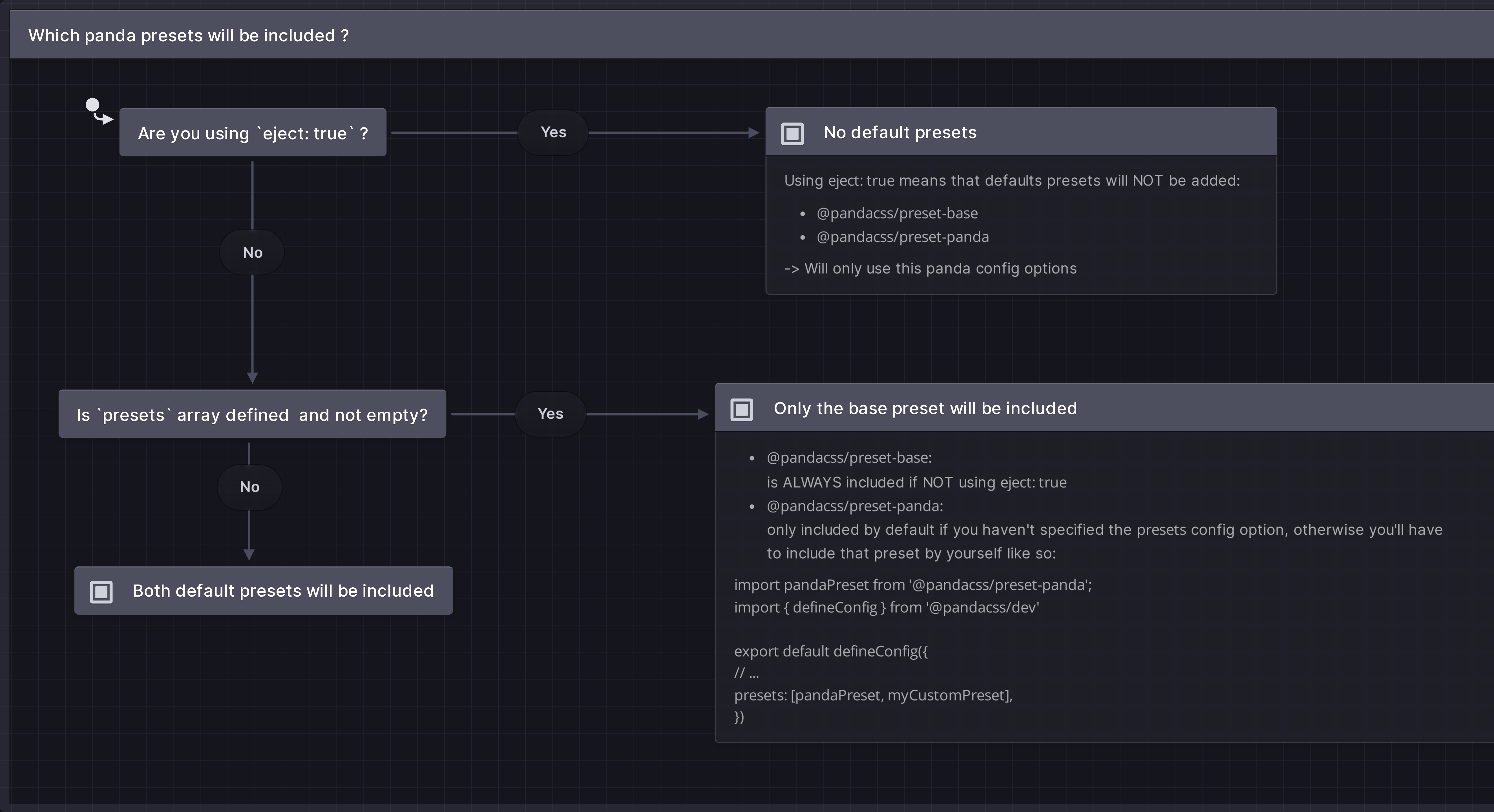
- `@pandacss/preset-base`: ALWAYS included if NOT using `eject: true`
- `@pandacss/preset-panda`: only included by default if you haven't specified the `presets` config option, otherwise
you'll have to include that preset by yourself like so:
```ts
import pandaPreset from '@pandacss/preset-panda'
import { defineConfig } from '@pandacss/dev'
export default defineConfig({
// ...
presets: [pandaPreset, myCustomPreset]
})
```
## Minimal setup
If you want to use Panda with the bare minimum, without any of the defaults, you can read more about it
[here](/docs/guides/minimal-setup)
---
## Theme
Customizing the default theme
Panda comes with a default theme that is used to generate the utilities for your project. You can customize this theme
to match your design requirements.
## Breakpoints
Use the `breakpoints` key in the `theme` section of your Panda config file to customize the default breakpoints.
```ts filename="panda.config.ts"
import { defineConfig } from '@pandacss/dev'
export default defineConfig({
theme: {
extend: {
breakpoints: {
'3xl': '1800px'
}
}
}
})
```
Panda ships with the following breakpoints by default:
## Tokens
### Colors
Use the `colors` key in the `token` section of your Panda config file to customize the default color values.
> We recommend using numeric ranges from `50` to `900`
```ts filename="panda.config.ts"
import { defineConfig } from '@pandacss/dev'
export default defineConfig({
theme: {
extend: {
tokens: {
colors: {
brand: { value: '#EA8433' }
}
}
}
}
})
```
Panda comes with a handful of colors picked from the amazing Tailwind color palette
### Spacing
Use the `spacing` key in the theme section of your Panda config file to customize the default spacing values.
```ts filename="panda.config.ts"
import { defineConfig } from '@pandacss/dev'
export default defineConfig({
theme: {
extend: {
tokens: {
spacing: {
gutter: { value: '32px' }
}
}
}
}
})
```
Panda ships with the following spacing tokens by default:
### Border Radius
Use the `radii` key in the theme section of your Panda config file to customize the default border radius values.
### Shadows
Use the `shadows` key in the theme section of your Panda config file to customize the default box shadows values.
Panda ships with the following shadows by default:
### Sizing
Use the `sizes` key in the theme section of your Panda config file to customize the default sizing values.
```ts filename="panda.config.ts"
import { defineConfig } from '@pandacss/dev'
export default defineConfig({
theme: {
extend: {
tokens: {
sizes: {
icon: { value: '24px' }
}
}
}
}
})
```
Panda ships with the following sizing tokens by default, in addition with the values from the default Panda
[spacing](#spacing) tokens:
### Fonts
Use the `fonts` key in the theme object to customize the default font families.
```ts filename="panda.config.ts"
import { defineConfig } from '@pandacss/dev'
export default defineConfig({
theme: {
extend: {
tokens: {
fonts: {
marketing: { value: 'Inter Variable' }
}
}
}
}
})
```
Panda ships with the following font families tokens by default:
### Font Sizes
Use the `fontSizes` key in the theme object to customize the default font sizes.
```ts filename="panda.config.ts"
import { defineConfig } from '@pandacss/dev'
export default defineConfig({
theme: {
extend: {
tokens: {
fontSizes: {
big: { value: '80px' }
}
}
}
}
})
```
Panda ships with the following font size tokens by default:
## Keyframes
Use the `keyframes` key in the `theme` section of your Panda config file to customize the default keyframes.
```ts filename="panda.config.ts"
import { defineConfig } from '@pandacss/dev'
export default defineConfig({
theme: {
extend: {
keyframes: {
fadein: {
'0%': { opacity: '0' },
'100%': { opacity: '1' }
},
fadeout: {
'0%': { opacity: '1' },
'100%': { opacity: '0' }
}
}
}
}
})
```
Panda ships with the following keyframes by default:
## Minimal setup
If you want to use Panda with the bare minimum, without any of the defaults, you can read more about it
[here](/docs/guides/minimal-setup)
---
## Utilities
The utility API is a way to create your own CSS properties, map existing properties to a set of values or tokens.
The utility API enables you to create custom CSS properties and map existing properties to specific values or tokens.
It's like building your own type-safe version of Chakra UI, Tailwind (in JS), or Styled System.
Panda comes with a set of utilities out of the box. You can customize them, or add your own.
Here are the properties you need to define or customize a utility:
- `className` : The className the property maps to
- `shorthand`: The shorthand or alias version of the property
- `values`: The possible values the property can have. Could be a token category, or an enum of values, string, number,
or boolean.
- `transform`: A function that converts the value to a valid css object
## Creating a custom utility
Let's say we want to create new property `br` that applies a border radius to an element.
```ts filename="panda.config.ts"
import { defineConfig } from '@pandacss/dev'
export default defineConfig({
utilities: {
extend: {
br: {
className: 'rounded', // css({ br: "sm" }) => rounded-sm
values: 'radii', // connect values to the radii tokens
transform(value) {
return { borderRadius: value }
}
}
}
}
})
```
Then you can run the following command to generate the pattern JS code:
{/* */}
```bash
pnpm panda codegen
```
```bash
npm panda codegen
```
```bash
yarn panda codegen
```
```bash
bun panda codegen
```
{/* */}
Now, we can use the `br` property in our components.
```jsx
import { css } from '../styled-system/css'
function App() {
return
}
```
or use in JSX style props
```jsx
import { styled } from '../styled-system/jsx'
function App() {
return
}
```
### Using enum values
Let's say we want to create a new property `borderX` that applies a limited set of inline border to an element and
automatically applies the border color.
```ts filename="panda.config.ts"
import { defineConfig } from '@pandacss/dev'
export default defineConfig({
utilities: {
extend: {
borderX: {
values: ['1px', '2px', '4px'],
shorthand: 'bx', // `bx` or `borderX` can be used
transform(value, { token }) {
return {
borderInlineWidth: value,
borderColor: token('colors.red.200') // read the css variable for red.200
}
}
}
}
}
})
```
Now, we can use the `borderX` or `bx` property in our components.
```jsx
import { css } from '../styled-system/css'
function App() {
return
}
```
### Using mapped values
```ts filename="panda.config.ts"
import { defineConfig } from '@pandacss/dev'
export default defineConfig({
utilities: {
extend: {
borderX: {
values: { small: '2px', medium: '5px' },
shorthand: 'bx',
transform(value, { token }) {
return {
borderTopWidth: value,
borderTopColor: token('colors.gray.400')
}
}
}
}
}
})
```
### Using boolean values
```ts filename="panda.config.ts"
import { defineConfig } from '@pandacss/dev'
export default defineConfig({
utilities: {
extend: {
truncate: {
className: 'truncate',
values: { type: 'boolean' },
transform(value) {
if (!value) return {}
return {
overflow: 'hidden',
textOverflow: 'ellipsis',
whiteSpace: 'nowrap'
}
}
}
}
}
})
```
## Minimal setup
If you want to use Panda with the bare minimum, without any of the defaults, you can read more about it
[here](/docs/guides/minimal-setup)
---
_This content is automatically generated from the official Panda CSS documentation._