Styling Base UI with Panda CSS
Use Panda CSS conditions and slot recipes to style Base UI Switch and Popover components.
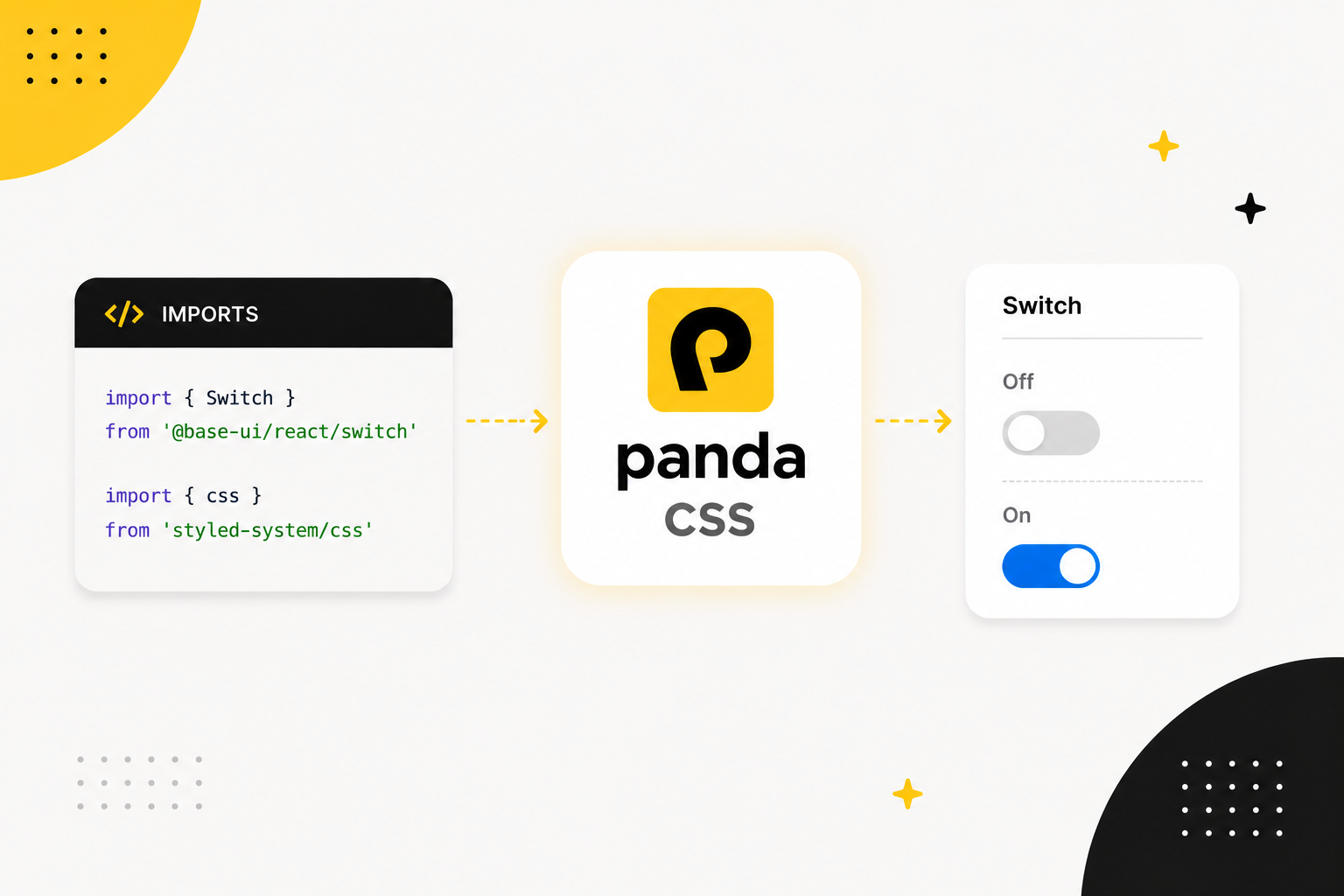
Base UI (opens in a new tab) gives you accessible React components with no bundled CSS. Panda CSS helps you style it with design tokens, recipes. In this post, you'll learn how to style the Switch and Popover components in Base UI (opens in a new tab).
Why they fit
Base UI (opens in a new tab) components are unstyled and compatible with any styling engine. Panda provides the styling engine with design tokens and recipes.
Base UI (opens in a new tab) gives you a few style hooks:
- Component parts that render HTML accept
className. - Component state is exposed through
data-*attributes. - Some components expose CSS variables for runtime values like size, available space, or transform origin.
Panda can target those attributes through built-in conditions. These already match the Base UI (opens in a new tab) states you'll use most:
| Panda condition | Matches |
|---|---|
_checked | [data-checked] |
_disabled | [data-disabled] |
_open | [data-open] |
_closed | [data-closed] |
_highlighted | [data-highlighted] |
_pressed | [data-pressed] |
For attributes Panda doesn't ship a condition for, add your own under conditions.extend in panda.config.ts.
Setup
Install the Base UI (opens in a new tab) React package:
pnpm add @base-ui/reactImport each component from its subpath:
import { Switch } from '@base-ui/react/switch'
import { Popover } from '@base-ui/react/popover'
The snippets import Panda utilities from your generated styled-system output.
Styling Switch
Here's the anatomy of the switch component
<label>
  <Switch.Root>
    <Switch.Thumb />
  </Switch.Root>
</label>Switch.Rootis the trackSwitch.Thumbis the circle that slides across it- The wrapping
labelgives the switch an accessible name
Here is the Switch styled with Panda's css function:
import { Switch } from '@base-ui/react/switch'
import { css } from 'styled-system/css'

export function ThemeSwitch() {
  return (
    <label
      className={css({
        display: 'inline-flex',
        alignItems: 'center',
        gap: '3',
        cursor: 'pointer'
      })}
    >
      <Switch.Root
        className={css({
          display: 'inline-flex',
          alignItems: 'center',
          width: '44px',
          height: '26px',
          padding: '3px',
          rounded: 'full',
          bg: 'gray.300',
          cursor: 'pointer',
          transition: 'background-color 150ms',
          _checked: { bg: 'blue.500' },
          _disabled: { opacity: 0.5 }
        })}
      >
        <Switch.Thumb
          className={css({
            width: '20px',
            height: '20px',
            rounded: 'full',
            bg: 'white',
            boxShadow: 'sm',
            transition: 'transform 150ms',
            _checked: { transform: 'translateX(18px)' }
          })}
        />
      </Switch.Root>
      Notifications
    </label>
  )
}
Open in StackBlitz (opens in a new tab).
The Switch renders data-checked or data-unchecked, and Panda's _checked condition targets that state.
Because Panda's built-in conditions were written with headless libraries in mind, _checked does not only mean
:checked. Its definition also covers Base UI (opens in a new tab)'s data-checked attribute:
// from Panda's base preset
checked: '&:is(:checked, [data-checked], [aria-checked=true], [data-state="checked"])'
Custom Conditions
There are data-attributes that might be not be supported by Panda out of the box, like data-touched or
data-scrolling, you have two options to style them:
- Use the native css selector approach with
css({ '&[data-touched]': { ... } }) - Add a custom condition in
panda.config.tsand use it like_touched. For example, to style a popup when it is open, add this to yourpanda.config.ts:
import { defineConfig } from '@pandacss/dev'

export default defineConfig({
  conditions: {
    extend: {
      touched: '&[data-touched]',
      scrolling: '&[data-scrolling]'
    }
  }
})
Then use it as _touched or _scrolling in your styling.
css({
  bg: 'blue.400',
  _touched: { bg: 'blue.500' },
  _scrolling: { opacity: 0.5 }
})
Styling Popover
The Switch has two parts. A Popover has more, and it renders through a portal. A slot recipe allows you to style those parts in one definition.
The component anatomy looks like this:
<Popover.Root>
  <Popover.Trigger />
  <Popover.Portal>
    <Popover.Positioner>
      <Popover.Popup>
        <Popover.Arrow />
        <Popover.Title />
        <Popover.Description />
        <Popover.Close />
      </Popover.Popup>
    </Popover.Positioner>
  </Popover.Portal>
</Popover.Root>
Slot recipe
You could call css on each part. That spreads the popover styles across the markup, and adding a size or color variant
means editing several places. Use a slot recipe instead. It defines every part in one place and returns a class for each
slot, variants included.
Here is a popover styled with sva:
// components/ui/popover.css.ts
import { sva } from 'styled-system/css'

export const popover = sva({
  slots: ['trigger', 'positioner', 'popup', 'arrow', 'title'],
  base: {
    positioner: {
      zIndex: 50
    },
    trigger: {
      px: '4',
      py: '2',
      rounded: 'md',
      bg: 'gray.900',
      color: 'white',
      cursor: 'pointer'
    },
    popup: {
      bg: 'white',
      rounded: 'lg',
      boxShadow: 'lg',
      border: '1px solid',
      borderColor: 'gray.200',

      // CSS variables exposed at runtime
      maxHeight: 'var(--available-height)',
      transformOrigin: 'var(--transform-origin)',

      _open: { animation: 'popIn 150ms ease-out' },
      _closed: { animation: 'popOut 150ms ease-in' }
    },
    arrow: {
      color: 'white'
    },
    title: {
      fontWeight: 'semibold',
      fontSize: 'sm'
    }
  },
  variants: {
    size: {
      sm: { popup: { width: '220px', p: '3' } },
      md: { popup: { width: '320px', p: '4' } }
    }
  },
  defaultVariants: {
    size: 'md'
  }
})
The popup uses the same state-attribute idea. Base UI (opens in a new tab) sets data-open while the popup is showing and data-closed as
it exits. Those are the exact attributes _open and _closed match, so all you add is a pair of keyframes:
// panda.config.ts
import { defineConfig } from '@pandacss/dev'

export default defineConfig({
  theme: {
    extend: {
      keyframes: {
        popIn: {
          from: { opacity: 0, transform: 'scale(0.95)' },
          to: { opacity: 1, transform: 'scale(1)' }
        },
        popOut: {
          from: { opacity: 1, transform: 'scale(1)' },
          to: { opacity: 0, transform: 'scale(0.95)' }
        }
      }
    }
  }
})
The transformOrigin: 'var(--transform-origin)' line uses a runtime variable from Base UI (opens in a new tab), so the popup scales from
the trigger instead of its center.
Now apply each slot in the markup. Calling popover() returns class names keyed by slot:
import { Popover } from '@base-ui/react/popover'
import { popover } from './popover.css'

export function NotificationsPopover() {
  const styles = popover({ size: 'md' })

  return (
    <Popover.Root>
      <Popover.Trigger className={styles.trigger}>Notifications</Popover.Trigger>
      <Popover.Portal>
        <Popover.Positioner className={styles.positioner} sideOffset={8}>
          <Popover.Popup className={styles.popup}>
            <Popover.Arrow className={styles.arrow} />
            <Popover.Title className={styles.title}>Notifications</Popover.Title>
            <Popover.Description>You are all caught up.</Popover.Description>
          </Popover.Popup>
        </Popover.Positioner>
      </Popover.Portal>
    </Popover.Root>
  )
}
See the popover styled with sva on StackBlitz (opens in a new tab).
Style context
Passing styles.trigger, styles.popup, and the rest works. If you reuse the Popover, wrap Base UI (opens in a new tab) parts once with
createStyleContext. It returns components with the recipe styles attached.
createStyleContext is imported from styled-system/jsx, which Panda only generates when jsxFramework is set. If you
haven't already, add it to your panda.config.ts:
// panda.config.ts
import { defineConfig } from '@pandacss/dev'

export default defineConfig({
  jsxFramework: 'react'
})
Use withRootProvider for the part that owns the context, and withContext for every styled part. Wrap each Base UI (opens in a new tab)
part once, map it to a slot, and export the set as a Popover object. Parts that don't need styles, like Portal,
Description, and Close, pass through:
// components/ui/popover.tsx
import { Popover as BasePopover } from '@base-ui/react/popover'
import { createStyleContext } from 'styled-system/jsx'
import { popover } from './popover-styles'

const { withRootProvider, withContext } = createStyleContext(popover)

export const Popover = {
  // Root renders no DOM element, so it only provides context
  Root: withRootProvider(BasePopover.Root),
  Trigger: withContext(BasePopover.Trigger, 'trigger'),
  Portal: BasePopover.Portal,
  Positioner: withContext(BasePopover.Positioner, 'positioner'),
  Popup: withContext(BasePopover.Popup, 'popup'),
  Arrow: withContext(BasePopover.Arrow, 'arrow'),
  Title: withContext(BasePopover.Title, 'title'),
  Description: BasePopover.Description,
  Close: BasePopover.Close
}
Now the usage has no manual class names, and the size variant flows through context:
import { Popover } from './components/ui/popover'

export function NotificationsPopover() {
  return (
    <Popover.Root size="md">
      <Popover.Trigger>Notifications</Popover.Trigger>
      <Popover.Portal>
        <Popover.Positioner sideOffset={8}>
          <Popover.Popup>
            <Popover.Arrow />
            <Popover.Title>Notifications</Popover.Title>
            <Popover.Description>You are all caught up.</Popover.Description>
          </Popover.Popup>
        </Popover.Positioner>
      </Popover.Portal>
    </Popover.Root>
  )
}
See the createStyleContext version on StackBlitz (opens in a new tab).
Two details matter:
- If the root renders an element you want to style, use
withProviderinstead ofwithRootProviderand pass the slot name. - Every wrapped part takes an
unstyledprop. Use it when one part should skip the recipe styles.
Next steps
Base UI (opens in a new tab) gives you accessible, unstyled components. Panda gives you tokens, conditions, and recipes for the visual
layer. Style each part through className, then use _checked, _open, _disabled, and the other built-in conditions
against Base UI (opens in a new tab)'s state attributes. For multi-part components, use a slot recipe. When you want reusable components,
wrap that recipe with createStyleContext.
To go deeper, see the Panda docs on recipes, slot recipes, conditional styles, and JSX style context.