Styling Ark UI with Panda CSS
Use Panda CSS conditions and slot recipes to style Ark UI components from their data attributes.
Ark UI (opens in a new tab) gives you headless React components. It handles behavior, accessibility, and state for things like checkboxes, dialogs, and menus. You bring the styles. In this blog, you'll learn how to style the Checkbox (opens in a new tab) and Dialog (opens in a new tab) components in Ark UI (opens in a new tab). Panda handles the visual layer with tokens, conditions, and recipes.
Why they fit
Ark UI (opens in a new tab) exposes component state through data-* attributes. Most states use data-state, with values like checked,
open, and indeterminate.
Panda can target those attributes through built-in conditions. These already match Ark UI (opens in a new tab)'s state attributes:
| Panda condition | Matches |
|---|---|
_checked | [data-state="checked"] |
_indeterminate | [data-state="indeterminate"] |
_open | [data-state="open"] |
_closed | [data-state="closed"] |
_disabled | [data-disabled] |
_focus | [data-focus] |
_hover | [data-hover] |
Panda also provides the concept of slot recipes to style components with multiple parts in a single definition.
Setup Ark UI
Install the Ark UI (opens in a new tab) React package alongside the icon library we use in this example:
pnpm add @ark-ui/react lucide-reactImport each component from its subpath:
import { Checkbox } from '@ark-ui/react/checkbox'
import { Dialog } from '@ark-ui/react/dialog'
Styling Checkbox
The Ark UI (opens in a new tab) Checkbox comes in a few components, here's what the anatomy looks like:
<Checkbox.Root>
  <Checkbox.Control>
    <Checkbox.Indicator />
  </Checkbox.Control>
  <Checkbox.Label />
  <Checkbox.HiddenInput />
</Checkbox.Root>Checkbox.Controlis the boxCheckbox.Indicatorholds the check markCheckbox.Labelis the textCheckbox.HiddenInputkeeps it accessible and form-friendly
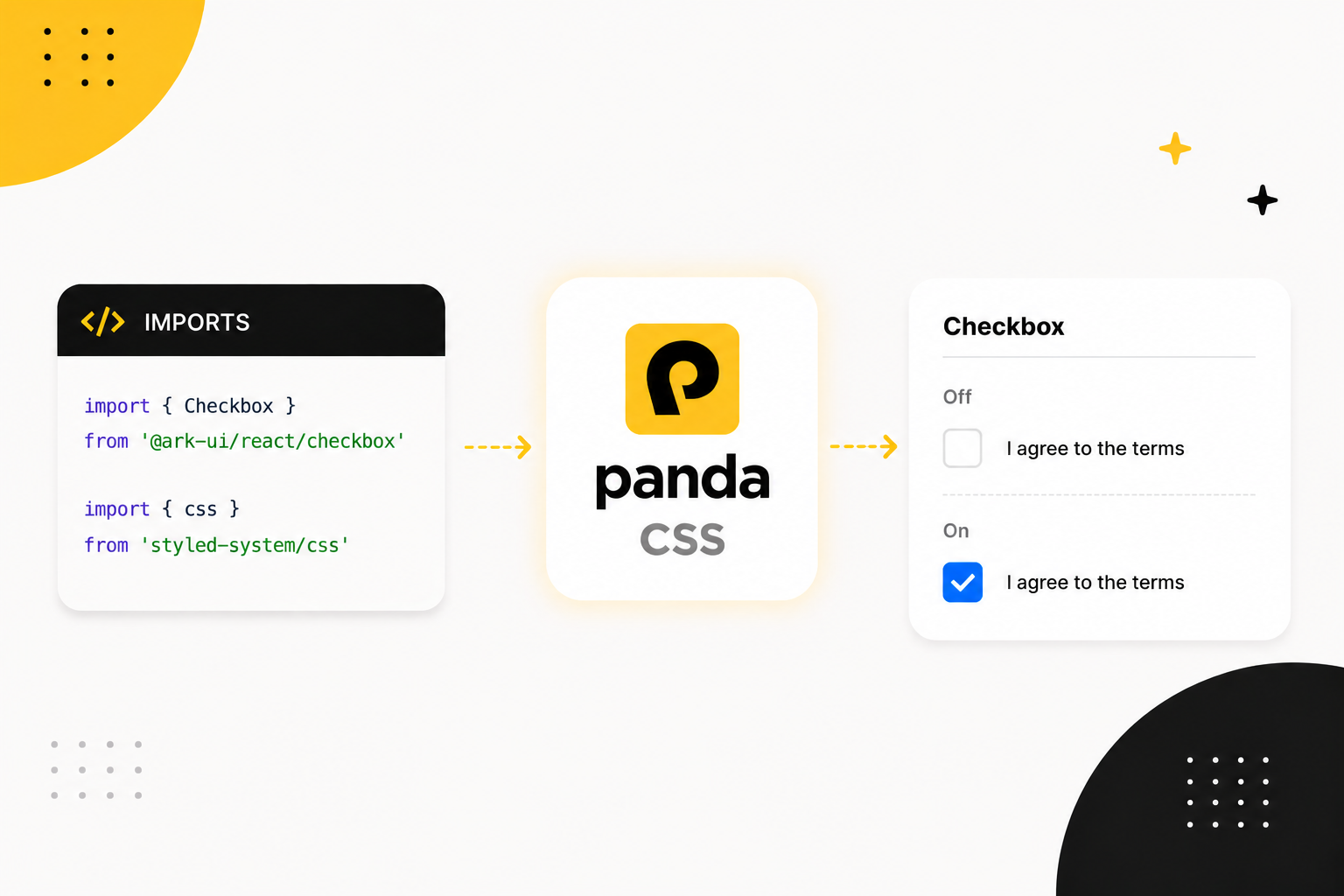
Here is the Checkbox styled using the css function from Panda.
import { Checkbox } from '@ark-ui/react/checkbox'
import { CheckIcon } from 'lucide-react'
import { css } from 'styled-system/css'

export function TermsCheckbox() {
  return (
    <Checkbox.Root
      className={css({
        display: 'inline-flex',
        alignItems: 'center',
        gap: '2.5',
        cursor: 'pointer',
        _disabled: { opacity: 0.5 }
      })}
    >
      <Checkbox.Control
        className={css({
          display: 'flex',
          alignItems: 'center',
          justifyContent: 'center',
          width: '24px',
          height: '24px',
          rounded: 'md',
          border: '2px solid',
          borderColor: 'gray.300',
          color: 'white',
          transition: 'background-color 150ms, border-color 150ms',
          _checked: { bg: 'blue.500', borderColor: 'blue.500' },
          _focusVisible: { outline: '2px solid', outlineColor: 'blue.500', outlineOffset: '2px' }
        })}
      >
        <Checkbox.Indicator className={css({ display: 'flex', alignItems: 'center', justifyContent: 'center' })}>
          <CheckIcon size={16} />
        </Checkbox.Indicator>
      </Checkbox.Control>
      <Checkbox.Label className={css({ fontSize: 'md', fontWeight: 'bold' })}>I agree to the terms</Checkbox.Label>
      <Checkbox.HiddenInput />
    </Checkbox.Root>
  )
}
Want to play with it? Open in StackBlitz (opens in a new tab).
The important part is the _checked block on the control. In plain CSS, :checked only applies to form inputs, like an
<input type="checkbox">. Checkbox.Control is a <div>, so it can never be :checked. The styles still apply
because Ark UI (opens in a new tab) adds state attributes.
Panda's _checked is broader than the CSS :checked pseudo-class. When Panda compiles it, the generated rule also
targets [data-state="checked"]. Ark UI (opens in a new tab) adds that attribute to the control when the box is checked. When Ark UI (opens in a new tab)
sets data-state="checked", your _checked styles match.
That covers the checked state without extra config.
Styling Dialog
A Dialog has more parts than a Checkbox, and it renders through a portal. A slot recipe keeps those parts together.
The component anatomy looks like this:
<Dialog.Root>
  <Dialog.Trigger />
  <Portal>
    <Dialog.Backdrop />
    <Dialog.Positioner>
      <Dialog.Content>
        <Dialog.CloseTrigger />
        <Dialog.Title />
        <Dialog.Description />
      </Dialog.Content>
    </Dialog.Positioner>
  </Portal>
</Dialog.Root>
Slot recipe
You could call css on each part. That spreads the dialog styles across the markup, and adding a size variant means
editing several places. Use a slot recipe instead. It defines every part in one place and returns a class for each slot,
variants included.
Here's the Panda slot recipe for the dialog, written with sva (the slot variant function):
// components/ui/dialog.css.ts
import { sva } from 'styled-system/css'

export const dialog = sva({
  slots: ['trigger', 'backdrop', 'positioner', 'content', 'title', 'description', 'closeTrigger'],
  base: {
    trigger: {
      px: '4',
      py: '2',
      rounded: 'md',
      bg: 'gray.900',
      color: 'white',
      cursor: 'pointer'
    },
    backdrop: {
      position: 'fixed',
      inset: '0',
      bg: 'black/50',
      zIndex: 50,
      _open: { animation: 'fadeIn 200ms ease-out' },
      _closed: { animation: 'fadeOut 200ms ease-in' }
    },
    positioner: {
      position: 'fixed',
      inset: '0',
      zIndex: 50,
      display: 'flex',
      alignItems: 'center',
      justifyContent: 'center',
      p: '4'
    },
    content: {
      position: 'relative',
      bg: 'white',
      rounded: 'lg',
      boxShadow: 'lg',
      width: 'full',
      _open: { animation: 'scaleIn 200ms ease-out' },
      _closed: { animation: 'scaleOut 200ms ease-in' }
    },
    title: {
      fontWeight: 'semibold',
      fontSize: 'lg'
    },
    description: {
      mt: '2',
      fontSize: 'sm',
      color: 'gray.600'
    },
    closeTrigger: {
      position: 'absolute',
      top: '3',
      right: '3',
      cursor: 'pointer',
      color: 'gray.500',
      _hover: { color: 'gray.800' }
    }
  },
  variants: {
    size: {
      sm: { content: { maxWidth: '320px', p: '5' } },
      md: { content: { maxWidth: '400px', p: '6' } }
    }
  },
  defaultVariants: {
    size: 'md'
  }
})
A dialog sits in the middle of the screen instead of anchoring to a trigger, so there are no positioning variables here. The positioner centers the content. Ark UI (opens in a new tab) handles the focus trap and scroll lock.
The backdrop and content animate from the same state attributes. Ark UI (opens in a new tab) marks the dialog data-state="open" while it
is showing and data-state="closed" on the way out.
Those are the values _open and _closed already match, so the only new piece is a handful of keyframes:
// panda.config.ts
import { defineConfig } from '@pandacss/dev'

export default defineConfig({
  theme: {
    extend: {
      keyframes: {
        fadeIn: {
          from: { opacity: 0 },
          to: { opacity: 1 }
        },
        fadeOut: {
          from: { opacity: 1 },
          to: { opacity: 0 }
        },
        scaleIn: {
          from: { opacity: 0, transform: 'scale(0.95)' },
          to: { opacity: 1, transform: 'scale(1)' }
        },
        scaleOut: {
          from: { opacity: 1, transform: 'scale(1)' },
          to: { opacity: 0, transform: 'scale(0.95)' }
        }
      }
    }
  }
})
Now wire each slot into the markup. Calling dialog() returns class names keyed by slot. Portal comes from Ark UI (opens in a new tab):
import { Dialog } from '@ark-ui/react/dialog'
import { Portal } from '@ark-ui/react/portal'
import { XIcon } from 'lucide-react'
import { dialog } from './dialog.css'

export function SignInDialog() {
  const styles = dialog({ size: 'md' })

  return (
    <Dialog.Root>
      <Dialog.Trigger className={styles.trigger}>Open Dialog</Dialog.Trigger>
      <Portal>
        <Dialog.Backdrop className={styles.backdrop} />
        <Dialog.Positioner className={styles.positioner}>
          <Dialog.Content className={styles.content}>
            <Dialog.CloseTrigger className={styles.closeTrigger}>
              <XIcon />
            </Dialog.CloseTrigger>
            <Dialog.Title className={styles.title}>Welcome back</Dialog.Title>
            <Dialog.Description className={styles.description}>Sign in to your account to continue.</Dialog.Description>
          </Dialog.Content>
        </Dialog.Positioner>
      </Portal>
    </Dialog.Root>
  )
}
See the dialog styled with sva on StackBlitz (opens in a new tab).
Style context
Threading styles.trigger, styles.content, and the rest through the markup works. If you use the Dialog in several
places, wrap the Ark UI (opens in a new tab) parts once with createStyleContext. It returns components with the recipe styles attached.
createStyleContext comes from styled-system/jsx, which Panda only generates once jsxFramework is set. If you
haven't set it yet, add it to your panda.config.ts:
// panda.config.ts
import { defineConfig } from '@pandacss/dev'

export default defineConfig({
  // ...
  jsxFramework: 'react'
})
createStyleContext gives you a few wrappers.
// components/ui/dialog.css.ts
const { withRootProvider, withProvider, withContext } = createStyleContext(dialog)- Use
withRootProviderfor the root part that when don't render a DOM node - Use
withProviderfor the root part when it renders a DOM node and needs the recipe styles - Use
withContextfor every styled part.
Wrap each Ark UI (opens in a new tab) part once, map it to a slot, and export the set as a Dialog object. Portal carries no styles, so
it passes through:
// components/ui/dialog.tsx
import { Dialog as BaseDialog } from '@ark-ui/react/dialog'
import { Portal } from '@ark-ui/react/portal'
import { createStyleContext } from 'styled-system/jsx'
import { dialog } from './dialog.css'

const { withRootProvider, withContext } = createStyleContext(dialog)

export const Dialog = {
  // Root renders no DOM element, so it only provides context
  Root: withRootProvider(BaseDialog.Root),
  Trigger: withContext(BaseDialog.Trigger, 'trigger'),
  Backdrop: withContext(BaseDialog.Backdrop, 'backdrop'),
  Positioner: withContext(BaseDialog.Positioner, 'positioner'),
  Content: withContext(BaseDialog.Content, 'content'),
  Title: withContext(BaseDialog.Title, 'title'),
  Description: withContext(BaseDialog.Description, 'description'),
  CloseTrigger: withContext(BaseDialog.CloseTrigger, 'closeTrigger'),
  Portal
}
Now the usage has no manual class names, and the size variant flows through context:
import { Dialog } from './components/ui/dialog'
import { XIcon } from 'lucide-react'

export function SignInDialog() {
  return (
    <Dialog.Root>
      <Dialog.Trigger>Open Dialog</Dialog.Trigger>
      <Dialog.Portal>
        <Dialog.Backdrop />
        <Dialog.Positioner>
          <Dialog.Content>
            <Dialog.CloseTrigger>
              <XIcon />
            </Dialog.CloseTrigger>
            <Dialog.Title>Welcome back</Dialog.Title>
            <Dialog.Description>Sign in to your account to continue.</Dialog.Description>
          </Dialog.Content>
        </Dialog.Positioner>
      </Dialog.Portal>
    </Dialog.Root>
  )
}
See the createStyleContext version on StackBlitz (opens in a new tab).
Next steps
Ark UI (opens in a new tab) gives you accessible, unstyled components. Panda gives you tokens, conditions, and recipes for the visual
layer. Style each part through className, then use _checked, _open, _disabled, and the other built-in conditions
against Ark UI (opens in a new tab)'s state attributes.
For multi-part components, use a slot recipe. When you want reusable components, wrap that recipe with
createStyleContext.
To go deeper, see the Panda docs on recipes, slot recipes, conditional styles, and JSX style context.