Introducing Panda CSS
Panda CSS is a build-time CSS-in-JS framework with type-safe design tokens, recipes, and zero runtime overhead.
Today we are releasing Panda CSS, a CSS-in-JS framework built for how teams actually build component libraries and design systems in 2024.
The problem with runtime CSS-in-JS
Libraries like styled-components and Emotion changed how we write styles. Colocating styles with components, having access to props at style time, and getting great TypeScript support were all genuine improvements.
But the approach has a cost that compounds as your app grows.
Runtime CSS-in-JS evaluates and injects styles in the browser. Every component render recalculates style objects. Every new style gets injected into the document at runtime. As your component tree grows, so does the overhead. On slow devices and slow networks, users feel it.
The bigger issue is newer. With React Server Components, components can run entirely on the server and never ship JavaScript to the client. Runtime CSS-in-JS relies on JavaScript running in the browser to inject styles. The two are fundamentally incompatible, and the React team has said so directly.
Panda takes a different approach to the whole problem.
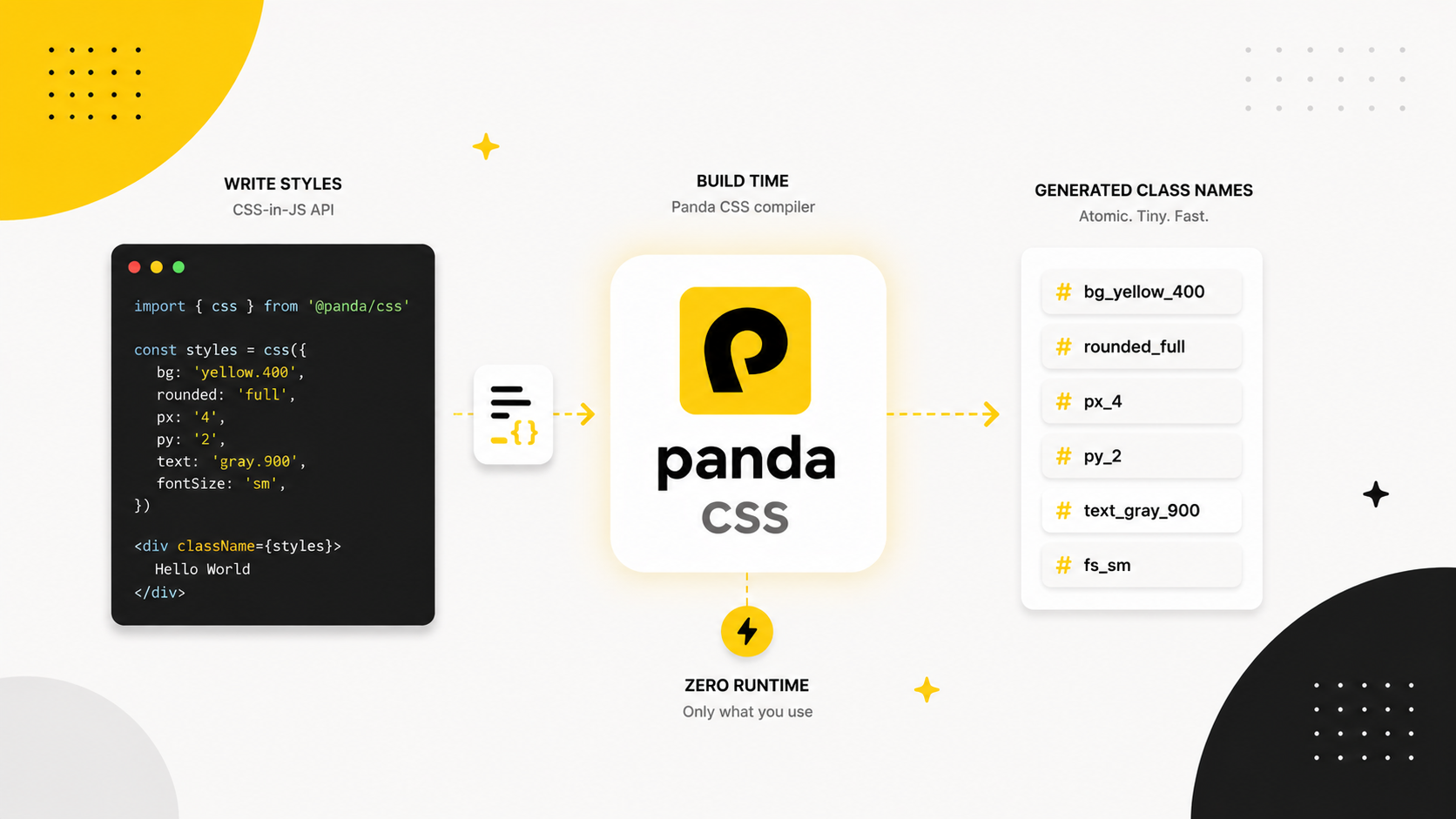
How Panda works
Panda runs at build time. It reads your source files, finds every style call, and generates a plain CSS file containing only the classes you actually use. Nothing is injected at runtime. No style recalculation on render. No hydration mismatch.
The output is static CSS. It loads with your page like any other stylesheet. Your components reference class names. That is the entire model.
This means Panda works in React Server Components, in Astro, in plain HTML if you want it. There is no JavaScript runtime requirement.
Type-safe design tokens
The foundation of Panda is its token system. You define your design tokens once in panda.config.ts, and every style prop in your codebase becomes type-safe against that definition.
panda.config.ts
import { defineConfig } from '@pandacss/dev'

export default defineConfig({
  theme: {
    tokens: {
      colors: {
        brand:   { value: '#f6c90e' },
        neutral: {
          100: { value: '#f5f5f5' },
          900: { value: '#171717' },
        },
      },
      fonts: {
        body:    { value: '"Inter", sans-serif' },
        heading: { value: '"Cal Sans", sans-serif' },
      },
      spacing: {
        4:  { value: '1rem' },
        8:  { value: '2rem' },
        12: { value: '3rem' },
      },
    },
  },
})
With strictTokens: true, writing color: '#ff0000' is a type error. Writing color: 'brand' autocompletes. The gap between "we have a design system" and "the team actually follows it" gets a lot smaller.
Semantic tokens
Primitive tokens are raw values. Semantic tokens reference primitives and carry intent. They are how you express context-aware values like dark mode colors or brand variants.
semanticTokens: {
  colors: {
    bg: {
      canvas: { value: { base: '#ffffff', _dark: '#0a0a0a' } },
      subtle:  { value: { base: '#f5f5f5', _dark: '#1a1a1a' } },
    },
    text: {
      default: { value: { base: '#171717', _dark: '#f5f5f5' } },
      muted:   { value: { base: '#737373', _dark: '#a3a3a3' } },
    },
  },
},
A component that uses bg: 'bg.canvas' automatically gets the right color in light mode and dark mode. You do not write any conditional logic in the component. The token handles it.
Conditions
Conditions are how Panda expresses pseudo-states, dark mode, and responsive breakpoints. They all use the same syntax: an underscore-prefixed key in your style object.
import { css } from '../styled-system/css'

const cardClass = css({
  bg: 'bg.canvas',
  color: 'text.default',
  borderRadius: 'lg',
  padding: '6',
  shadow: 'sm',
  _hover:    { shadow: 'md' },
  _dark:     { borderColor: 'neutral.800' },
  _focus:    { outline: '2px solid', outlineColor: 'brand' },
  _disabled: { opacity: '0.5', cursor: 'not-allowed' },
})
Responsive styles work the same way, using breakpoint keys:
const headingClass = css({
  fontSize:   { base: '2xl', md: '3xl', lg: '4xl' },
  fontWeight: 'bold',
  lineHeight: 'tight',
})
All of this compiles to atomic CSS classes at build time. The output is predictable, auditable, and exactly as small as it needs to be.
Recipes
Recipes are how you define a component's visual API. A recipe captures the base styles, the variants, and the default variant values in one typed object.
import { cva } from '../styled-system/css'

const button = cva({
  base: {
    display:        'inline-flex',
    alignItems:     'center',
    fontWeight:     'semibold',
    borderRadius:   'md',
    cursor:         'pointer',
    transition:     'all 0.2s',
    _disabled: { opacity: '0.5', cursor: 'not-allowed' },
  },
  variants: {
    variant: {
      solid:   { bg: 'brand', color: 'black', _hover: { opacity: '0.9' } },
      outline: { borderWidth: '1px', borderColor: 'brand', color: 'brand' },
      ghost:   { color: 'brand', _hover: { bg: 'neutral.100' } },
    },
    size: {
      sm: { h: '8',  px: '3', fontSize: 'sm' },
      md: { h: '10', px: '4', fontSize: 'md' },
      lg: { h: '12', px: '6', fontSize: 'lg' },
    },
  },
  defaultVariants: { variant: 'solid', size: 'md' },
})<button className={button({ variant: 'outline', size: 'sm' })}>
Click me
</button>Recipes are typed end to end. Passing an invalid variant is a compile error. The variants object is the public API of your component's visual states.
Slot recipes for multi-part components
Not every component is a single element. A checkbox has a root, a control, and a label. A modal has a backdrop, a container, and a close button. sva (Slot Variant Array) handles these:
import { sva } from '../styled-system/css'

const checkbox = sva({
  slots: ['root', 'control', 'label'],
  base: {
    root:    { display: 'flex', alignItems: 'center', gap: '2' },
    control: {
      w: '5', h: '5',
      borderWidth: '2px',
      borderRadius: 'sm',
      _checked: { bg: 'brand', borderColor: 'brand' },
    },
    label:   { fontSize: 'md', color: 'text.default' },
  },
  variants: {
    size: {
      sm: { control: { w: '4', h: '4' }, label: { fontSize: 'sm' } },
      md: { control: { w: '5', h: '5' }, label: { fontSize: 'md' } },
    },
  },
  defaultVariants: { size: 'md' },
})
Each slot gets its own scoped class name. No more fighting CSS specificity between parts of the same component.
JSX components
When you set jsxFramework: 'react' in your config, Panda generates a set of JSX components that accept style props directly. No class names required.
import { Box, Stack, HStack } from '../styled-system/jsx'

const Card = ({ title, children }) => (
  <Box bg="bg.canvas" p="6" borderRadius="lg" shadow="sm">
    <Stack gap="4">
      <Box fontSize="lg" fontWeight="semibold" color="text.default">
        {title}
      </Box>
      <Box color="text.muted">
        {children}
      </Box>
    </Stack>
  </Box>
)
Box is a div with all Panda style props. Stack is a flex column with a gap prop. HStack is horizontal, VStack is vertical. Every prop is typed against your token system.
The panda() factory creates styled elements from any HTML tag:
import { panda } from '../styled-system/jsx'

const Label = panda('label', {
  base: {
    fontSize: 'sm',
    fontWeight: 'medium',
    color: 'text.default',
  },
})
Works everywhere
Panda generates a standard CSS file and a set of utility functions. It does not care what framework renders your components.
- Next.js (App Router, Pages Router, Server Components)
- Astro
- Vite
- Remix
- SvelteKit
- Any build pipeline that can run a PostCSS plugin or a CLI step
The installation guides cover setup for each framework.
Get started
npm install -D @pandacss/dev
npx panda init --postcss
panda init creates your panda.config.ts, adds the PostCSS plugin, and runs the first codegen. From there, define your tokens and start writing styles.
The full documentation is at panda-css.com/docs. If you run into anything, the Discord (opens in a new tab) and GitHub (opens in a new tab) are the best places to reach us.
We built Panda because we needed it. We hope you find it as useful as we do.