Building a Multi-Brand Design System with Panda CSS
Build a multi-brand design system in Panda CSS with brand-aware tokens, themes, and a shared preset.
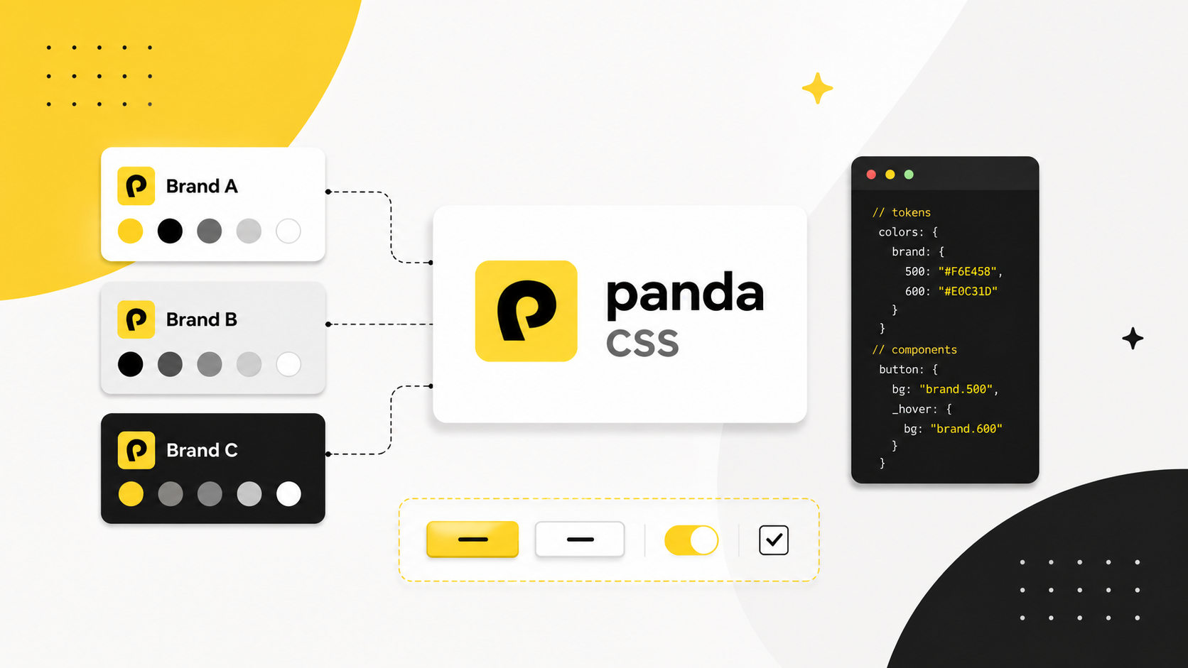
Multi-brand design systems are a specific kind of hard. You need one component library that renders as Brand A in one context and Brand B in another, without duplicating your components, shipping separate stylesheets, or scattering brand logic throughout your component code.
This guide covers how to build a multi-brand design system with Panda CSS and shipping the whole thing as a shared preset that other teams can consume.
Why Choose Panda CSS for a Multi-Brand Design System
Panda runs at build time, generates a single plain CSS file, and handles brand switching at the CSS variable layer. Your components never change. The brand does.
Runtime CSS-in-JS evaluates styles in the browser. Adding a second brand means interpolating brand values into your style functions at runtime, which grows the JavaScript cost with every brand you add. SSR hydration gets complicated, and runtime style injection does not work in a server-only component tree.
Panda sidesteps all of this. Each theme defines its own semantic token overrides and gets compiled to a scoped
[data-panda-theme] selector. Switching brands is a single attribute change. Every token value is inferred into your
style props, so brand mismatches are type errors, not silent production bugs. No runtime, no hydration concerns, no
per-brand stylesheets.
The Config is Your Schema
Everything in Panda flows from panda.config.ts. This file is the contract between your design decisions and your
component code.
panda.config.ts
import { defineConfig } from '@pandacss/dev'

export default defineConfig({
  include: ['./src/**/*.{ts,tsx}'],
  outdir: 'styled-system',
  jsxFramework: 'react',
  preflight: true,
  strictTokens: true,
  theme: {
    extend: {
      semanticTokens: {}
    }
  },
  themes: {},
  staticCss: {
    themes: ['*']
  }
})
When you run panda codegen, Panda writes a styled-system/ directory into your project. That directory contains
everything your components need:
styled-system/
├── css/        # css(), cva(), sva(), cx(), mergeCss()
├── recipes/    # compiled recipe functions
├── patterns/   # flex, grid, stack, container, etc.
├── jsx/        # Box, Stack, Flex, and the panda() factory
├── tokens/     # token values and CSS variable names
└── themes/     # per-theme JSON and injectTheme/getTheme utilities
This directory is generated code. Commit it. It should stay in sync with your config, and your CI should verify that.
strictTokens: true enforces that every style value must come from a token you have defined. For a shared design
system this is the right default: it closes the gap between "we have a token system" and "the team actually uses it."
Setting Up Your Tokens
Define the Default Theme
Within the theme object in your config, define the default semantic tokens for your application. These are the values
every component uses unless a named theme overrides them:
theme: {
  extend: {
    semanticTokens: {
      fonts: {
        cardTitle: { value: 'Inter' },
      },
      colors: {
        cardBg: { value: 'white' },
        cardAccent: { value: 'black' },
      },
    },
  },
},
Define Multiple Themes
Use the themes key to define each additional brand. Each theme accepts tokens for raw primitive values and
semanticTokens for aliased values. Only specify what needs to override the default. Everything else falls back:
themes: {
  'brand-b': {
    tokens: {
      colors: {
        accent: { value: '#e53e3e' },
      },
    },
    semanticTokens: {
      fonts: {
        cardTitle: { value: 'Domine' },
      },
      colors: {
        cardBg: { value: 'white' },
        cardAccent: { value: '{colors.accent}' },
      },
    },
  },
  'brand-c': {
    tokens: {
      colors: {
        accent: { value: '#276749' },
      },
    },
    semanticTokens: {
      fonts: {
        cardTitle: { value: 'Paytone One' },
      },
      colors: {
        cardBg: { value: '{colors.green.50}' },
        cardAccent: { value: '{colors.accent}' },
      },
    },
  },
},
Panda compiles each named theme into a scoped CSS selector. Any component rendered inside an element with the matching
data-panda-theme attribute picks up that theme's token values automatically.
Themes are not limited to color. Typography and shape are just as brand-defining. You define them the same way: set the
defaults in theme, then override per brand in themes:
theme: {
  extend: {
    semanticTokens: {
      fonts: {
        body: { value: 'Inter' },
        heading: { value: 'Inter' },
      },
      radii: {
        pill: { value: '{radii.md}' },
      },
    },
  },
},

themes: {
  'brand-c': {
    semanticTokens: {
      fonts: {
        body: { value: 'EB Garamond' },
        heading: { value: 'EB Garamond' },
      },
      radii: {
        pill: { value: '{radii.full}' },
      },
    },
  },
},
A component using fontFamily: 'body' and borderRadius: 'pill' adapts its typeface and shape to the active
brand without any conditional logic.
Generate Themes
Add staticCss to tell Panda to generate CSS for all defined themes:
theme: {
  // your default theme
},
themes: {
  // your named themes
},
staticCss: {
  themes: ['*'],
},
After running panda codegen, Panda generates scoped CSS for every theme. The default theme tokens apply at :root;
named theme tokens are scoped to [data-panda-theme="<name>"].
Using The Themes
Where to place data-panda-theme depends on your product structure. If each deployment is a single brand, set it on
<html>:
// app/layout.tsx (Next.js)
<html data-panda-theme="brand-b">
Switching Themes at Runtime
Codegen produces two utilities in styled-system/themes: getTheme and injectTheme.
getTheme(name) lazily loads the theme's CSS via a dynamic import, which keeps the initial bundle small. Only the
active theme's CSS is fetched. injectTheme(el, theme) injects a scoped <style> tag into the document head and sets
data-panda-theme on the target element.
import { getTheme, injectTheme } from '../styled-system/themes'

const handleThemeChange = async (themeName: string) => {
  const theme = await getTheme(themeName)
  injectTheme(document.documentElement, theme)
}

return (
  <select onChange={(e) => handleThemeChange(e.target.value)}>
    <option value="brand-b">Brand B</option>
    <option value="brand-c">Brand C</option>
  </select>
)
Every component inside the container resolves to that theme's token values. Components outside it continue using the defaults. This means multiple brands can coexist on the same page (a shared widget, a multi-tenant dashboard, a live theme preview) without any component changes.
If you are shipping a design system that other teams consume, export a typed ThemeProvider that wraps injectTheme
so consumers do not need to know the implementation details:
import { getTheme, injectTheme } from '../styled-system/themes'

type ThemeName = 'brand-b' | 'brand-c'

export const ThemeProvider = ({ theme, children }: { theme: ThemeName; children: React.ReactNode }) => {
  useEffect(() => {
    getTheme(theme).then((t) => injectTheme(document.documentElement, t))
  }, [theme])

  return <>{children}</>
}
Get Started
Install Panda and initialize your config:
npm install -D @pandacss/dev
npx panda init --postcss
panda init writes a starter panda.config.ts, adds the PostCSS plugin, and generates your initial styled-system/
directory. From there, define your default semantic tokens, add your named themes, and run:
npx panda codegenThe full documentation is at panda-css.com/docs. The installation guides cover framework-specific setup for Next.js, Vite, Astro, Remix, and others.
Most of the difficulty with multi-brand design systems comes from putting brand logic in the wrong layer: component props, duplicated stylesheets, runtime evaluation that grows with every brand you add. Panda keeps all of that in the config, which is where it belongs. Your components stay clean. Adding a new brand is a config change, not a codebase change.